

Tom Paper's Glimpse Talk for GSB Reunion - October 2025
Step 0 of 0
1

How...
2
Video of Tom Paper's Glimpse Talk to GSB 35-year Reunion - October 11, 2025
3

A Rainy & Miserable Night
4

A Happy Camper
5
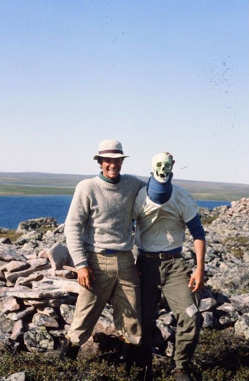
Alas, poor Yorick
6
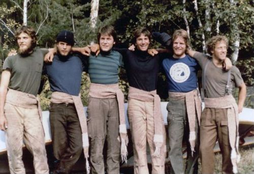
Voyageurs
7
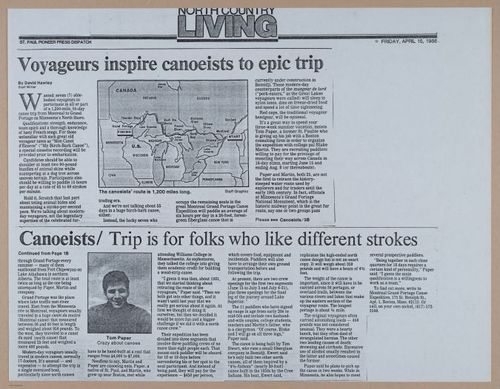
Crazy About Canoes
8
Discovered Antique Maps
9
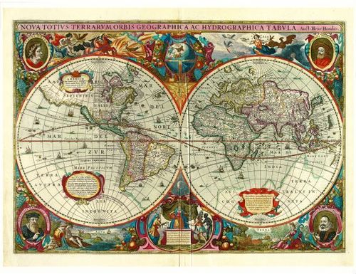
Hendrik Hondius - 1630
10
![[ 2025-08-23 23:45:09 ]](https://iiif.pixeum.org/iiif/3/1755992738/full/500,/0/default.jpg)
[ 2025-08-23 23:45:09 ]
11
![[ 2025-08-23 23:44:31 ]](https://iiif.pixeum.org/iiif/3/1755992707/full/500,/0/default.jpg)
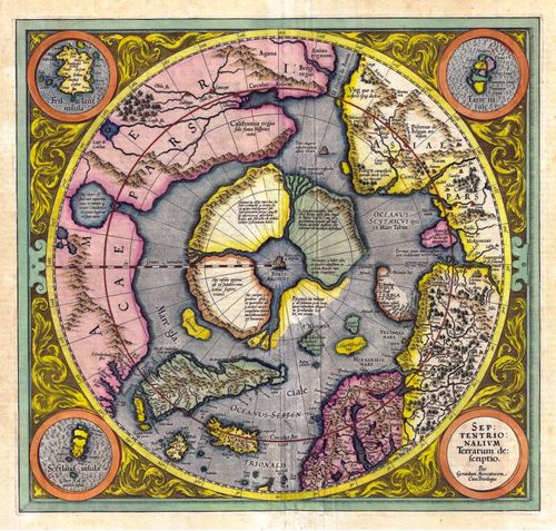
[ 2025-08-23 23:44:31 ]
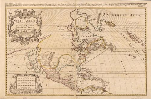
12
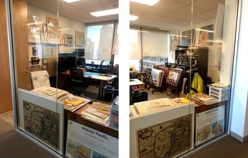
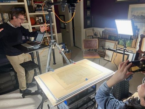
Out of Space
13
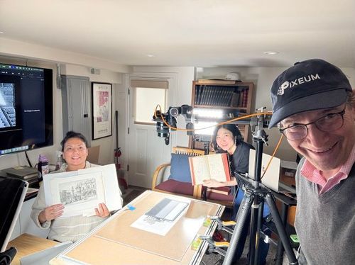
Started Digitizing
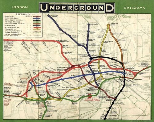
14

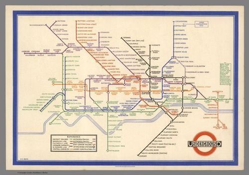
My website
15
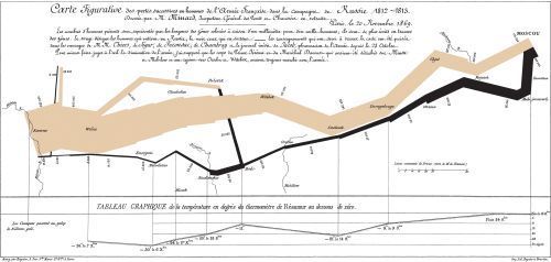
![[ 2025-09-23 03:17:03 ]](https://iiif.pixeum.org/iiif/3/1758597452/full/500,/0/default.jpg)
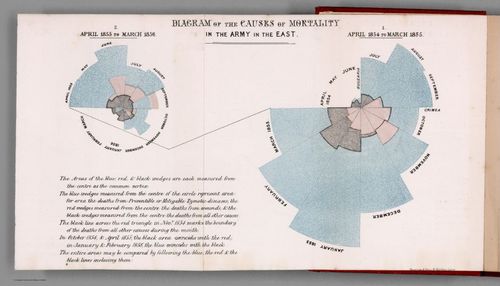
[ 2025-09-23 03:17:03 ]
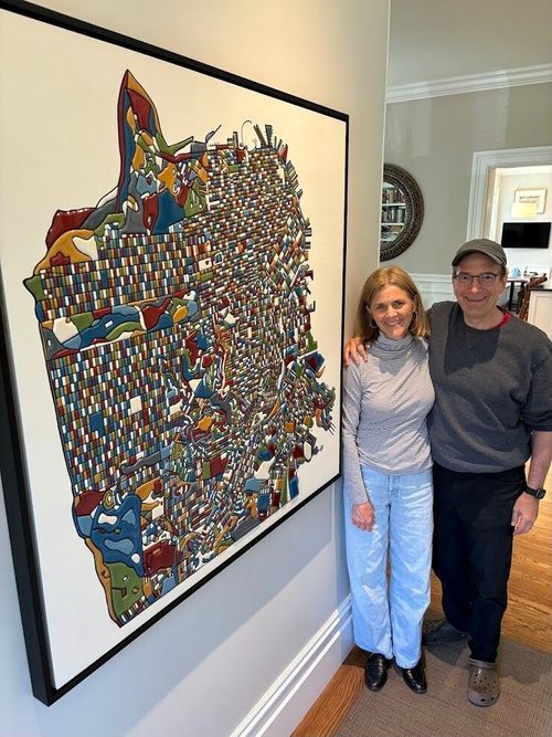
16
Crazy about maps
17
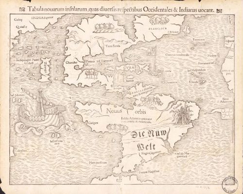
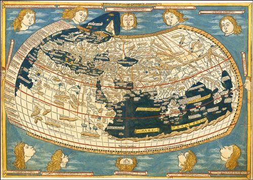
North and South America - Munster - 1559
18
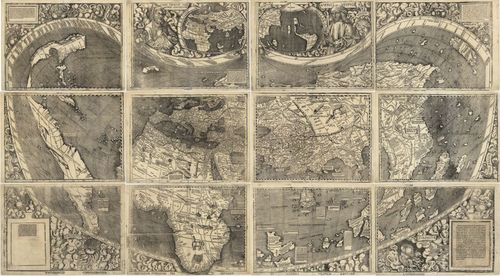
The World - Waldseemueller - 1507
19
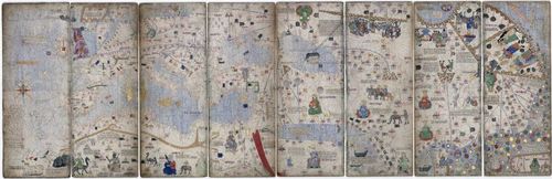
Catalan Atlas - 1375 - from Wikipedia
20
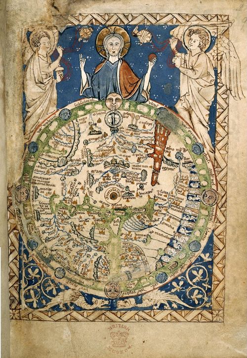
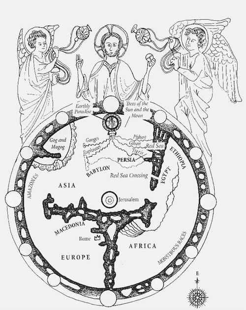
Psalter Map - artist unknown - 1265
21
2025-08-26 14:49:48
22
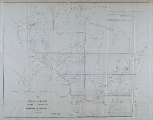
State of Wisconsin and the Territory of Minnesota
23
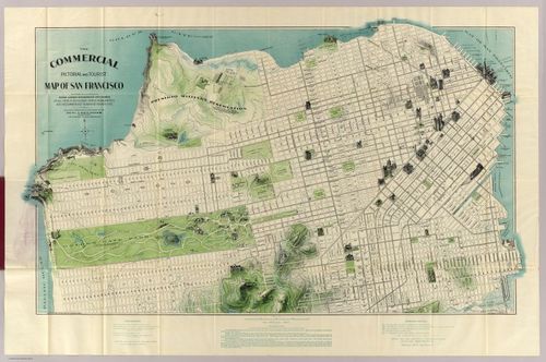
San Francisco - Chevalier - 1904
24
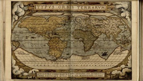
Typus Orbus Terrarum - Ortelius - 1570
25
North Pole - Gerardus Mercator - 1569
26
North America - Berry & Sanson - 1680
27
E308 - Images for Hist23 Maps: Past, Present & Future
28
A new map of the north parts of America - Herman Moll - 1732
29
![[ 2025-08-20 02:45:35 ]](https://iiif.pixeum.org/iiif/3/1755657979/full/500,/0/default.jpg)
[ 2025-08-20 02:45:35 ]
30
London Underground Map - 1908
31
London Underground - 1933 - Harry Beck
32
The Minard Map of Napolean's March - 1869
33
Florence NightingaleDUPLICATED
34
![[ 2025-08-20 03:18:02 ]](https://iiif.pixeum.org/iiif/3/1755659936/full/500,/0/default.jpg)
[ 2025-08-20 03:18:02 ]
35
I Left My Heart(s) In San Francisco - Miriam Sweeney - 2023
36
![[ 2025-08-22 17:24:45 ]](https://iiif.pixeum.org/iiif/3/1755883504/full/500,/0/default.jpg)
[ 2025-08-22 17:24:45 ]
37

Maps for the Blind - Lighthouse - 2025
38
Ulm Ptolemy - 1482
39
![[ 2025-09-04 16:10:13 ]](https://iiif.pixeum.org/iiif/3/1758585968/full/500,/0/default.jpg)
[ 2025-09-04 16:10:13 ]
40
![[ 2025-09-04 16:10:35 ]](https://iiif.pixeum.org/iiif/3/1757002260/full/500,/0/default.jpg)
[ 2025-09-04 16:10:35 ]
41
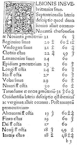
Ptolemy’s Geographia


Place a DOT on the image