Member Favorite Maps - California Map Society (CMS)
Step 0 of 0
1

2

3

4

5

6

7

8

9

10

11
12

13

14

15

16

17

18

19

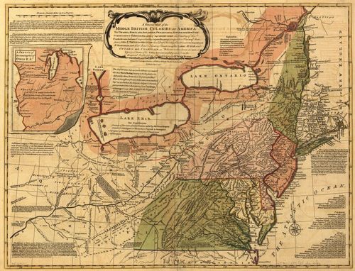
A Map of the Middle British Colonies in America - Ken Habeeb
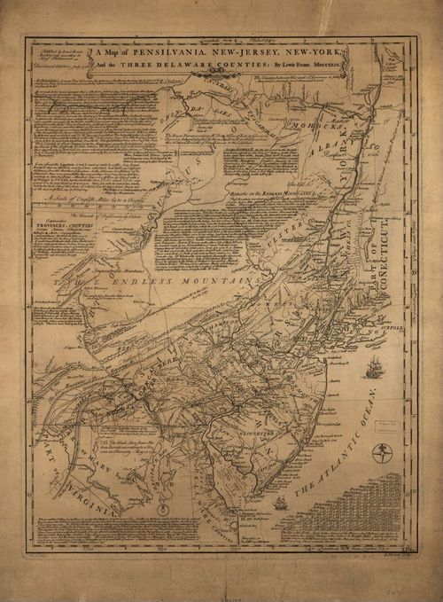
A Map of Pennsylvania, New-Jersey, New-York, and the Three Delaware Counties - from Ken Habeeb
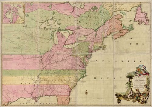
A Map of the British and French Dominions in North America - from Ken Habeeb
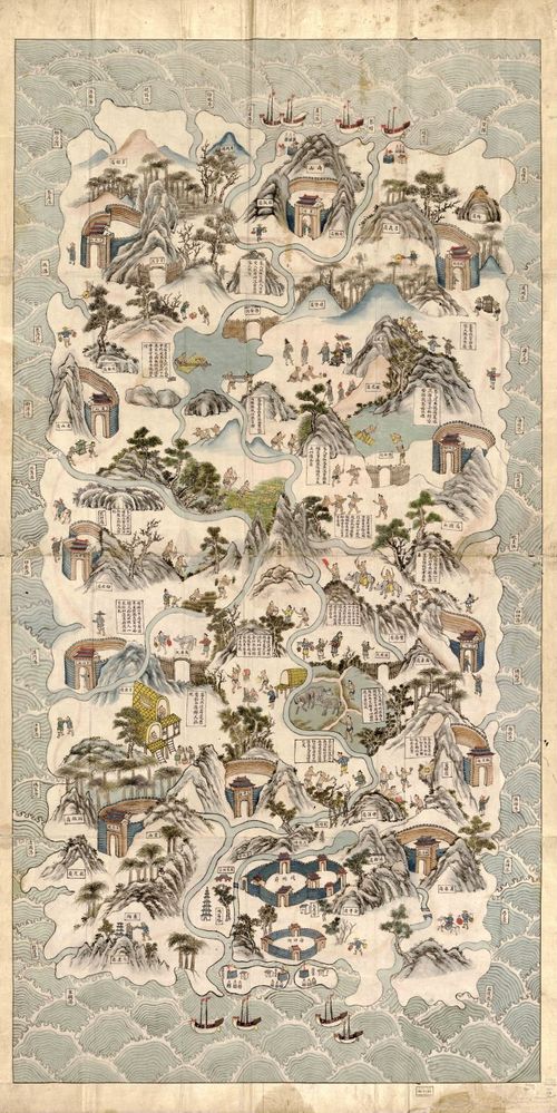
Qiong Jun di yu quan tu (Hainan Island) - 1836 - from Linda Rui Feng
"This vibrant pictorial map is oriented southward to look across the sea toward Hainan Island off the southern coast of China. It contains detailed ethnographic descriptions of the indigenous Li people and shows that, even by the late Qing dynasty (1644-1911), this island was still very much culturally distinct and seemingly "beyond the pale." Linda Rui Feng
Source: Library of Congress
Location Map:

Source: Google Maps
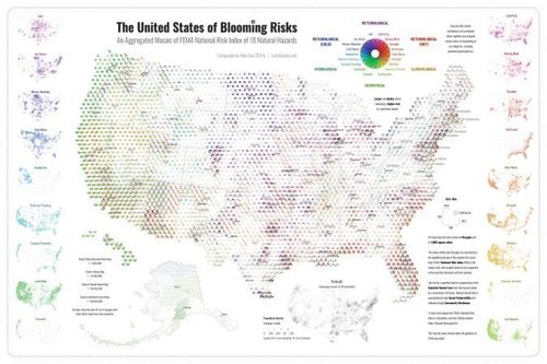
The United States of Blooming Risks - Dan Scollon
"This map is a striking cartographic product, addressing contemporary concerns, while employing emerging geospatial methods. The risk score combines hex bins representing population density and risk factors. These are then combined on the main map which uses ‘pinwheels’ to represent risks across the country. A stunning and relevant example of the potential of maps." Dan Scollon
[ 2025-08-14 12:50:07 ]
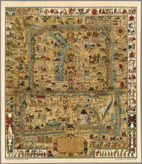
Frank Dorn’s Map of Peiping (Beijing) - Edward Lanfranco
The artwork is titled "A Map and History of Peiping" and was created by Frank Dorn in 1936.
"Sometimes I feel like the Will Rogers of cartography. I’ve never met a map I didn’t like. This makes it difficult to single out any one representation of China, the primary focus of my collection, as being a “favorite.” How to decide which map: by intended audience? (schoolchild, tourist, geologist, apparatchik); format size? (from pocket atlas to wall map); publication century (17th to 21st CE); creator ethnicity? (Chinese, Japanese, European, or American); sponsoring organization? (the CIA, the Chinese Communist Party, or Corona beer).
As a CMS/Calafia cadre, Sinologist, and Beijing historian, I’ll go with the 1936 Map and History of Peiping created by Frank “Pinky” Dorn (1901-1981). Note Jo Mora influences illustrating a city in flux. Dorn’s biography reveals an unappreciated 20th CE American polymath. Imagine 1920s education in an San Francisco art school then graduating from West Point. Dorn’s accomplishments include decorated warrior, published novelist, linguist, cartographer, painter, and gourmand." Edward Lanfranco
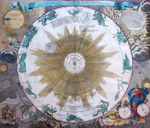
Systema Solare et Planetarium - Nick Kanas
"One of my favorite star maps was produced by Johann Doppelmayr around 1720 and depicts the state of astronomical knowledge in the early 1700s. In the center is a spectacular representation of Copernicus’s Sun-centered heliocentric system. In the upper left corner are images of the seven known planets overlapping the Sun. In the upper right are diagrams of other solar systems believed to exist around the stars. In the lower left is a depiction of the solar eclipse of May 12, 1706, with California shown as an island. In the lower right are three cosmological systems: Ptolemy’s geocentric system, allegorically obliterated by contemporary astronomical instruments; Tycho Brahe’s hybrid system showing Earth in the center orbited by the Moon and the Sun, which is surrounded by the other planets; and Copernicus’ model endorsed by Urania, the goddess of Astronomy." Nick Kanas
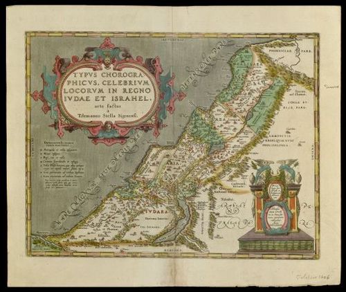
Typus Chorographicus - Leonard Rothman, MD
Choreographic Map of the Famous Places in the Kingdom of Judea and Israel
"This 36cmx46cm map, published by Abraham Ortelius in 1590, is based on Tilemann Stella’s Holy Land map of 1552. It is oriented with North at the top. The West extends from Sidon in Phoenicia to Egypt, and the East from Phoenicia to the southern tip of the Dead Sea. The Holy Land is divided into the two kingdoms of Judea and Israel. Samaria, upper Galilee, and lower Galilee are included in Israel. The 12 tribes, descended from Jacob, are demarcated by dashed lines. The cartouche and legend are decorated in the style of Ortelius’ home city of Antwerp. The pastel coloring throughout is another Antwerpian favorite.
This map is unique because of its keystone list of symbols, which appear in the Mediterranean Sea. This is possibly the first map to have such a list." Leonard Rothman, MD
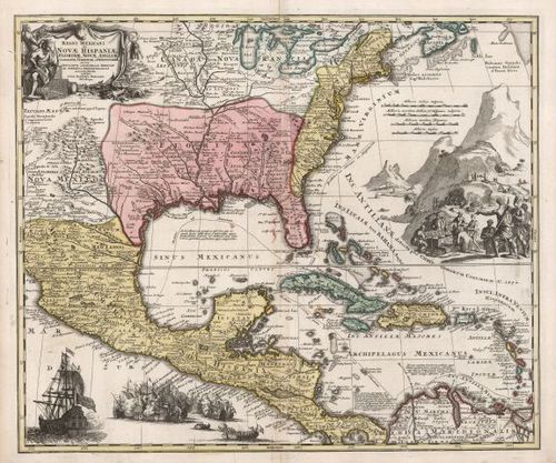
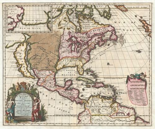
Regni Mexicani seu Nova Hispaniae - Thomas Sander
Created by Johann Baptist Homann, a renowned German cartographer, around 1716.
"Part two of this story. As we were relocating here in early 2024, our daughter knew my room had an adjacent bathroom with tub, so she decided to search online for a map-themed shower curtain. When I opened the gift, I was overjoyed to find the curtain’s map was the same Regni Mexicani map that hung on the wall outside the bathroom. It was pure serendipity for her to choose a curtain with THIS special map; she did not look earlier to see what maps I had chosen for the room. I smile every time I point out these two maps to visitors." Thomas Sander

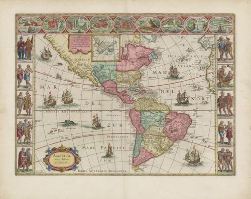
Americae Nova Tabula - Richard Breiman
"Willem Blaeu’s vignette maps of four continents, first created in 1617.
- I am drawn to maps that combine scientific, historical and educational content with artistic and decorative features
- My favorites are vignette maps from Blaeu, Speed, Jansson and others
- At a time way before National Geographic and other magazines, and now web-based search engines providing educational information, etc. vignettes augmented the geographical details available to the viewer of a map in the 17th century, at least in terms of the appearance and dress of the inhabitants of the regions included on the map, as well as miniature maps of prominent cities in the region. They also include depictions of animals frequently found in their typical habitats.
- My favorite vignette maps:
- Blaeu’s vignette maps of 4 continents 1st created in 1617
- North and South America, Europe, Africa and Asia
- Blaeu’s vignette maps of 4 continents 1st created in 1617
- Of these, Blaeu’s map of the Americas “Americae Nova Tabula” is my favorite
- I love a challenging hunt for a difficult acquisition (particularly when it’s successful) and Blaeu’s map of the Americas was the most difficult for me to acquire. I don’t yet own Blaeu’s vignette map of the world, but if I did, it would become my favorite
- Interesting to see what was known and not known in the 17th century about the region with which I am most familiar and what was made-up
- Display of inaccuracies and imaginary features
- The artistic embellishments such as sea monsters and sailing ships flying the flags of various contemporary naval powers, as well as the pleasing artistic composition and colors enhance the viewer’s interest and appreciation of the map." Richard Breiman
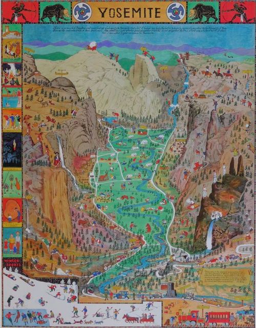
Jo Mora's Yosemite Pictorial Carte - Peter Hiller
"At the risk of being obvious, Jo Mora's carte making ranks among my favorites, especially his depiction of Yosemite. I love pictorial maps, unique design, and a sense of humor. In addition to featuring many actual sites in Yosemite, Jo's visual puns stand out, showcasing his engaging and playful nature. For me, the highlights on the watercolor are the numerous vignettes that correspond to the journal entries he scribed upon his first visit, in 1903, to Yosemite, thirty years before he created the map. If you are curious about the connections, search for a copy of From Dust to Granite—The Yosemite Art and Writing of Jo Mora—a must-read for anyone who loves Yosemite." Peter Hiller
For more information on Jo Mora:
https://www.montereyhistory.org/shop/from-dust-to-granite-the-yosemite-art-and-writing-of-jo-mora/

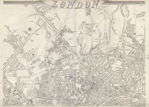
Shows part of north London in 1863 - Stephen Johnson
"This is a sheet showing part of north London from Edward Weller’s 1863 nine-sheet map of London. The map is centered on Highbury in north Islington and captures the city growing northwards. It illustrates for me the superimposition of the Victorian city filling the gaps in the 18th-century and earlier streetscape." Stephen Johnson
Louis Hennepin's Map of North America - Thomas Worth
"Hennepin accompanied LaSalle on his exploration of the Great Lakes and the upper Mississippi River basin for France, and then published this extensive map of North America after LaSalle’s death to falsely imply that he had explored the river to its mouth. The map erroneously shows the mouth to be some 300 miles too far to the west; some commentators have speculated this was deliberate, to discourage colonization of the Gulf area by rival nations. This excellent summary of the state of knowledge of the geography of North America at the beginning of the 18th century delineates the areas controlled by Britain, France, and Spain. Interestingly, the map is dedicated to William III, King of England, when Hennepin fell out of favor with the French government." Thomas Worth
source: wikipedia
see write up at Geographicus
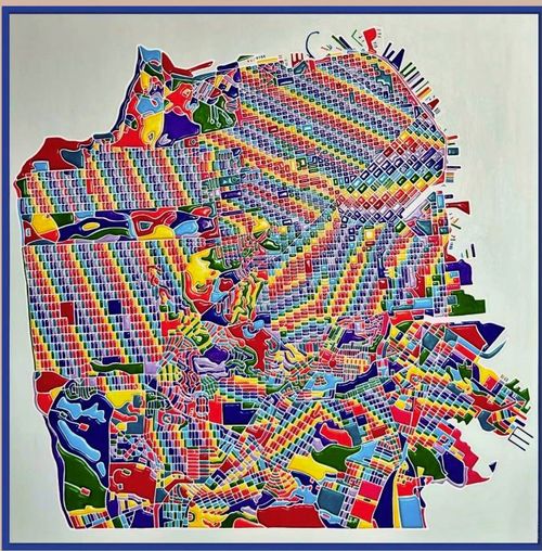
Miriam Sweeney's Pride of San Francisco Map - David Kageyama
Drawing inspiration from city aerial views, Sweeney's work explores the urban landscape that sits somewhere between order and chaos, structure and collapse, expression and control.
"When I look at Miriam Sweeney's art of San Francisco, I marvel at the mosaic and bright, contrasting colors of her artwork, and it reminds me of Van Gogh's "Starry Nights" where his impressionist artwork depicts the abstract concept of "Turbulence." His Artwork was an imaginary depiction of a concept that was not readily visible …the currents of the wind, with the evidence of moving leaves, etc. Anyway, Miriam's artwork of San Francisco reminds me of the "Mosaic of People" consisting of a "Mosaic of Ideas" from a "Mosaic of Cultures." San Francisco is definitely a "Mosaic of Diversity within the City!" David Kageyama
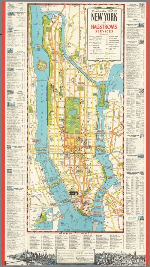
Complimentary map of New York from Hagstrom Services - 1946 - Jack Gerwe
“This map stood out to me because it has a very detailed key that highlights the locations that were relevant to Manhattan at the time. It also shows the detailed ferry routes, which were likely a more important form of transportation in comparison to today.“ Jack Gerwe 8/17/25


[ 2025-08-18 01:28:37 ]
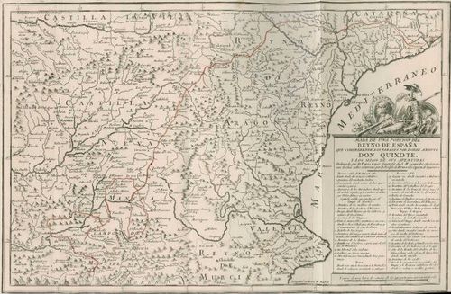
Mapa de una Porcion del Reyno de España que Comprehende los Parages por Donde Anduvo Don Quixote y los Sitios de sus Aventuras - Steve Hanon
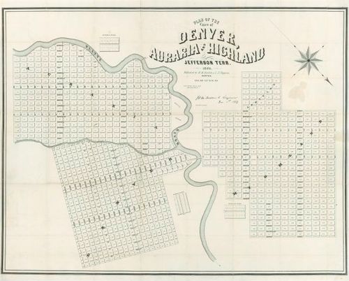
The first printed map of Denver - Wes Brown
Plan of the City of Denver, Auraria, and Highland Jefferson Terr. 1859
"This is the first printed map of Denver showing the three cities on the banks of the South Platte River and Cherry Creek. “Plan of the City of Denver, Auraria, and Highland Jefferson Terr. 1859.” By H.M. Fosdick & L.N. Tappan. Shortly after this printing, the three towns merged into Denver City. The fledgling community was created as the headquarters for the enormous gold rush to Western Kansas Territory beginning in the fall of 1858, which is believed to have brought 100,000 eager miners and others to the diggings in the Denver area and the mountains nearby. Within two years, the new territory of Colorado was formed." Wes Brown
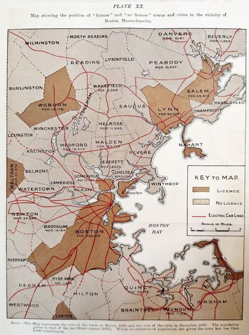
Temperance Problem and Social Reform Map - Boston 1900 - Kris Butler
Map of Boston and environs alcohol licensing laws circa 1900.
"This is a map of Boston’s licensing laws included in the 7th through 9th editions of Rowntree and Sherwell’s ‘The Temperance Problem and Social Reform’ (1900). I found it when writing ‘Drink Maps in Victorian Britain’ and purchased a copy of the book, but as I don’t believe in breaking books for the maps. I assumed I’d just admire it from within the pages. I kept looking online until I found a version in “poor” condition (cover and several pages missing- but all maps intact!), which is how a copy of this map ended up on my wall." Kris Butler
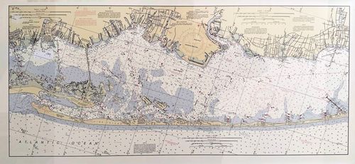
Fire Island – NOAA Nautical Chart - Larry Lusk
"I love this NOAA map of Fire Island for so many reasons. First of all, I love Fire Island! I first came here with my parents in 1956 when I was three years old when we rented a house in Lonelyville. Unfortunately, Lonelyville is not shown on the map, but it lies between Atlantique and Dunewood, where my parents bought a house in 1968. Today I share the house with two of my brothers.
One of the things that the map makes abundantly clear is how fragile this 30-mile-long barrier beach/sandbar is. Using the scale, you can see that it is only about 400 yards from the ocean to the bay in our part of the island. Also, the map shows how shallow most of the Great South Bay is, with marked depths of 1 to 3 feet! You can see where channels have been dredged to allow for navigation. You can also see how littoral drift or current-driven migration of sand has extended the island to the west, almost 5 miles from the location of the Fire Island lighthouse, which was built on what was then the very western tip of the island in 1858!" Larry Lusk
Place a DOT on the image