

HIST23B - Playground - January 2024
Step 0 of 0
1
![[ 2024-12-31 23:33:36 ]](https://iiif.pixeum.org/iiif/3/1735688030/full/500,/0/default.jpg)
[ 2024-12-31 23:33:36 ]
2
![[ 2024-12-31 23:33:51 ]](https://iiif.pixeum.org/iiif/3/1735688068/full/500,/0/default.jpg)
[ 2024-12-31 23:33:51 ]
3
![[ 2024-01-03 15:51:45 ]..](https://iiif.pixeum.org/iiif/3/1704513564/full/500,/0/default.jpg)
[ 2024-01-03 15:51:45 ]..
4
![[ 2024-12-31 23:26:11 ]](https://iiif.pixeum.org/iiif/3/1735687579/full/500,/0/default.jpg)
[ 2024-12-31 23:26:11 ]
5
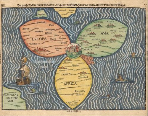
Bunting Clover Leaf Map - 1581
6
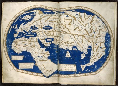
Martellus world map
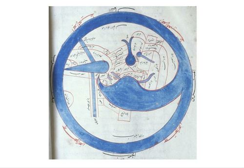
7
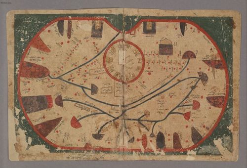
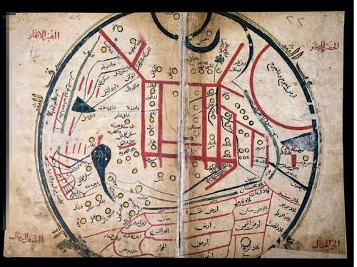
Book of Curiosities
8
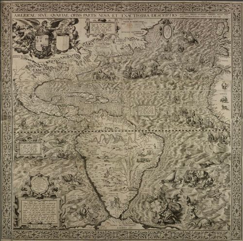
Americae Sive Quartae Orbis Partis Nova Et Exactissima Descriptio (Teddy Palmore)
9

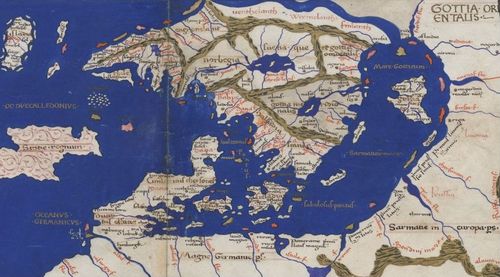
Carta Marina 1539 - Map of Scandinavian countries/ North of Europe Denis Sotnichenko
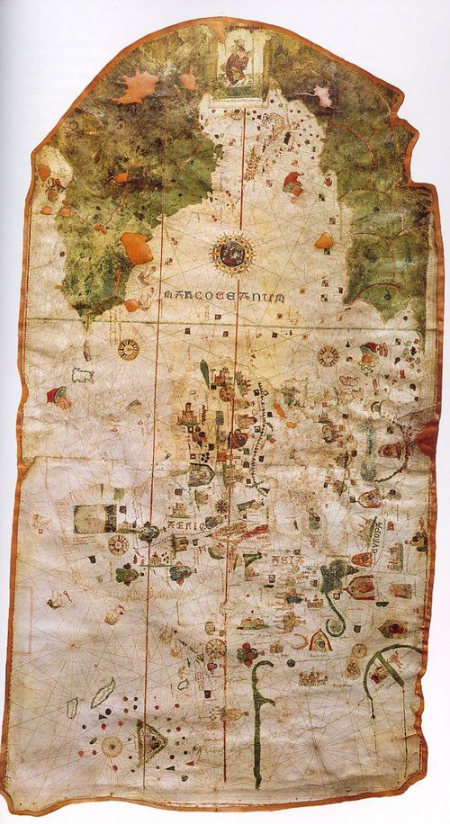
10
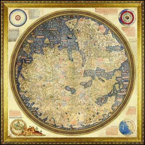
Fra Mauro Map (Nikhil DeNatale)
11
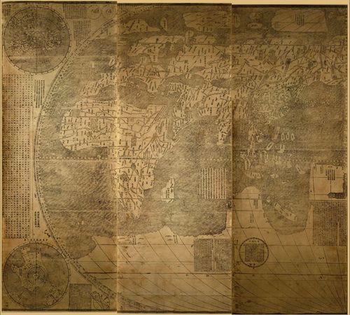
Kunyu Wanguo Quantu (1 of 2) (John Steinmetz)
12
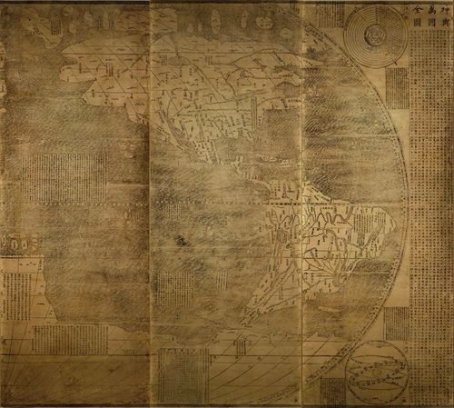
Kunyu Wanguo Quantu (2 of 2) (John Steinmetz)
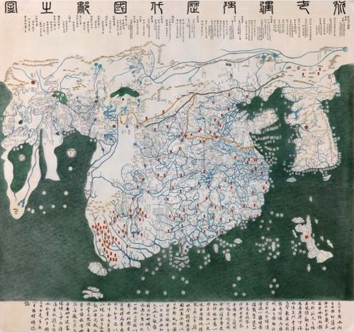
13
Julian Arenas - Map from Compendium of the Turkic Dialects
14
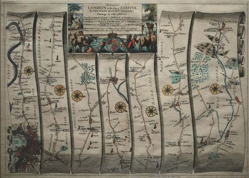
John Ogilby: The Road from London to The City of Bristol
15
E444 - KMMS World Map - cartographer unknown - 878 AH / 1473 CE - Jeff Sousa
16
Map of Juan de la Cosa-SRW
17
Gangnido - Brandon Joung
18
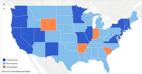
Forma Urbis Fragment (Joe Miotto)
19
Cantino Planisphere (Barrett Heritage)
20
1584 Portolan Chart of the Mediterranean - Joan Martines (Andrew Gu)
21
![[ 2024-01-04 15:56:13 ] (Reona Kubomiya)](https://iiif.pixeum.org/iiif/3/1704383901/full/500,/0/default.jpg)
[ 2024-01-04 15:56:13 ] (Reona Kubomiya)
22
Bartolomeo Pareto, 1455 (Oscar Nobel)
23
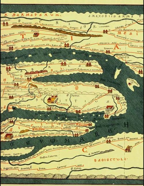
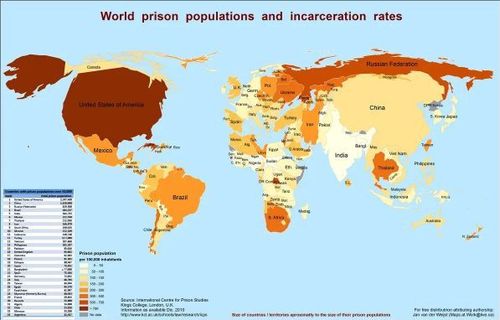
Tabula Peutingeriana (Chris Malone)
24
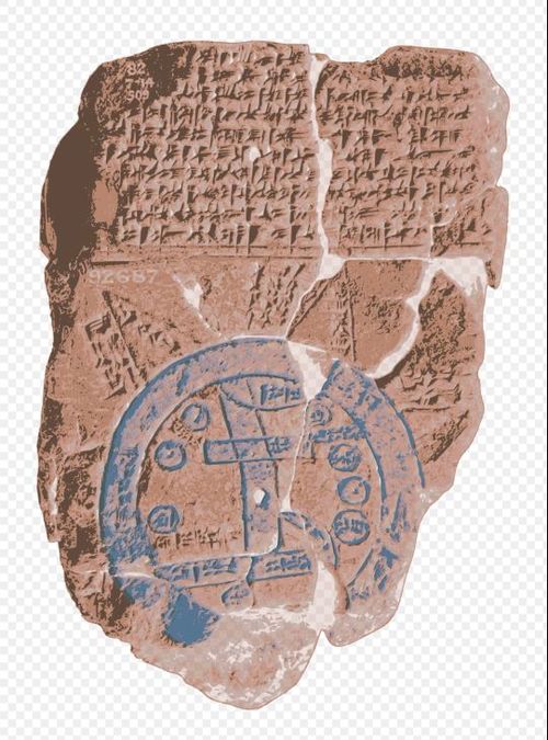
Babylonian Map of the World, 700-500 BC (Nathan Moldavsky)
25
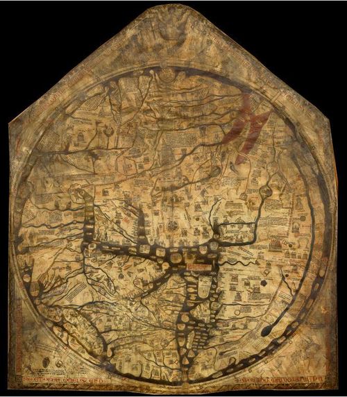
Hereford Mappa Mundi (Aly Eward)
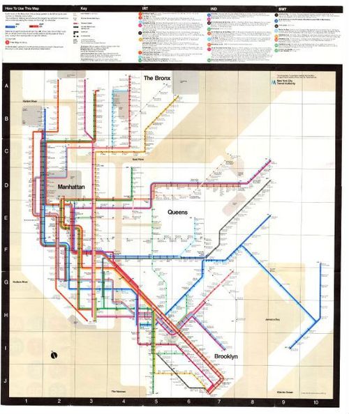
26
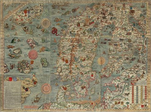
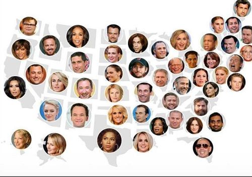
Carta Marina 1539 - Map of Scandinavian countries/ North of Europe
27
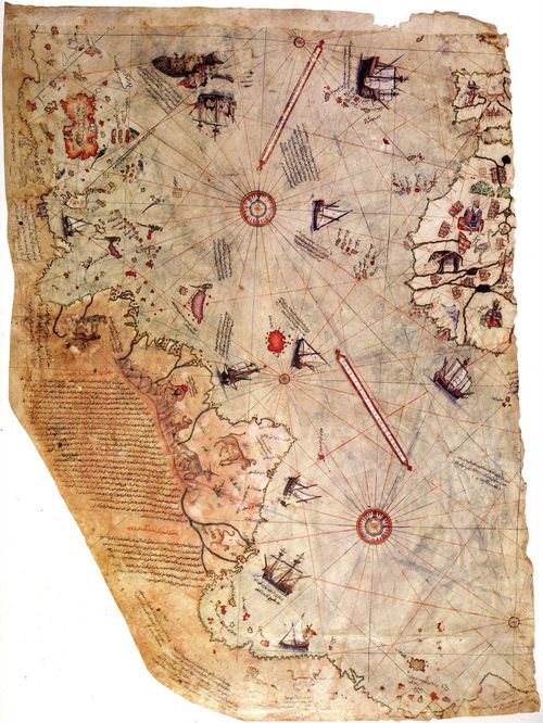
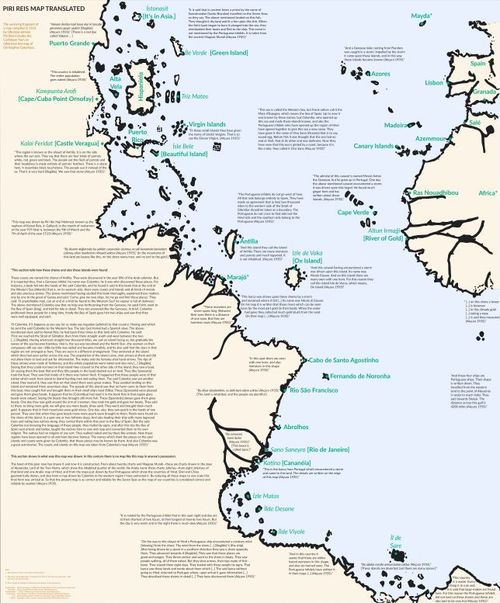
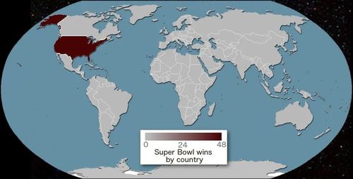
Piri reis map - 1513 (Fletcher Hoven)
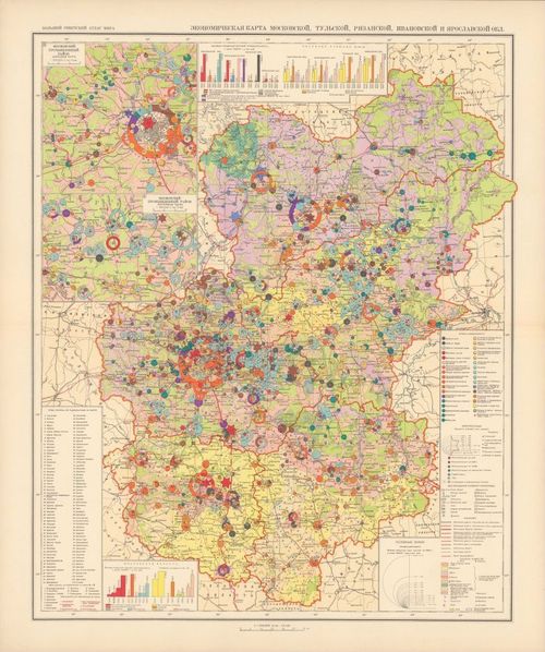
28
2026-02-01 17:18:28
29
![[ 2024-01-11 14:34:41 ]](https://iiif.pixeum.org/iiif/3/1704983696/full/500,/0/default.jpg)
[ 2024-01-11 14:34:41 ]
30
![[ 2024-01-11 14:35:08 ]](https://iiif.pixeum.org/iiif/3/1704983718/full/500,/0/default.jpg)
[ 2024-01-11 14:35:08 ]
31
![[ 2024-01-11 14:35:31 ]](https://iiif.pixeum.org/iiif/3/1704983741/full/500,/0/default.jpg)
[ 2024-01-11 14:35:31 ]
32
![[ 2024-12-31 23:04:01 ]](https://iiif.pixeum.org/iiif/3/1735686249/full/500,/0/default.jpg)
[ 2024-12-31 23:04:01 ]
33
![Digital Humanities - Digitally Created Graphic Scores - Brandon Joung [REFER TO MY OTHER IMAGE]](https://iiif.pixeum.org/iiif/3/1705152202/full/500,/0/default.jpg)
Digital Humanities - Digitally Created Graphic Scores - Brandon Joung [REFER TO MY OTHER IMAGE]
34
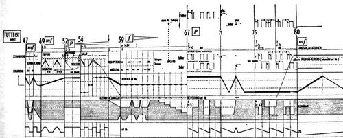
Digital Humanities - Score for Mikrophonie I - Karlheinz Stockhausen - (Brandon Joung)
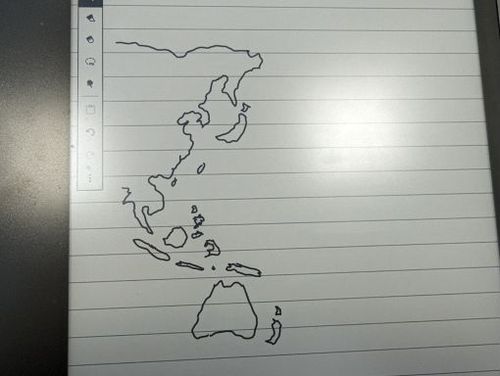
35
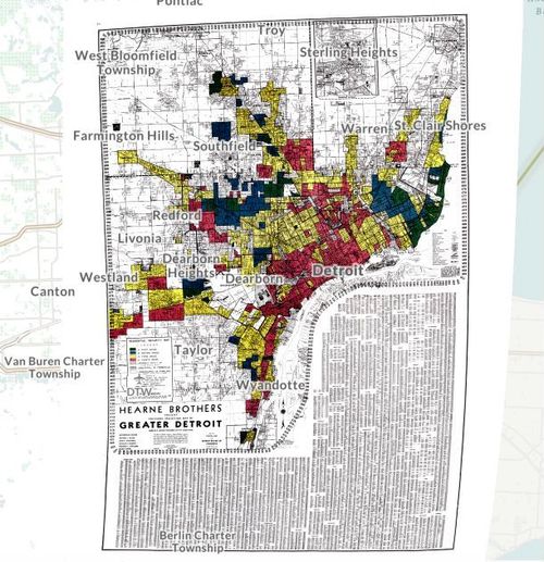
Digital Humanities – Detroit Redlining - Chris Malone
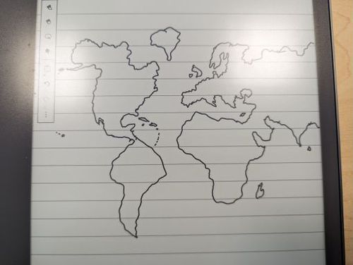
36
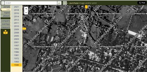
Digital Humanities - Historical Aerials - Connor Connolly
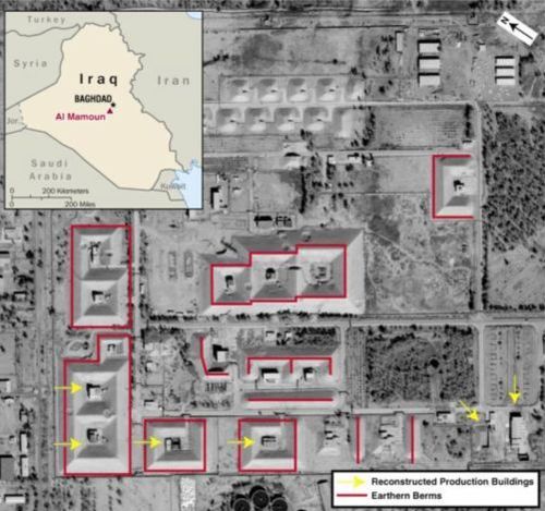
37
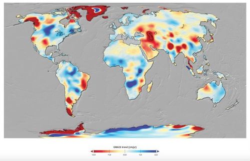
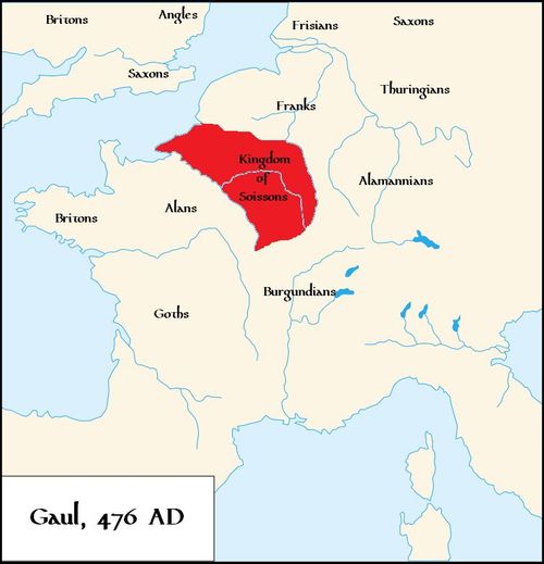
Digital Humanities – A Map of the Future of Water - Orr Teva
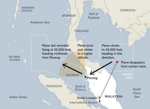
38
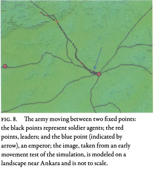
Digital Humanities - Medieval Warfare on the Grid - Andrew Gu
39
Digital Humanities-Sam Reynoso Williams
40
Digital humanities - Living New Deal - Teddy Palmore
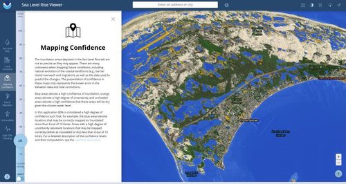
41
Digital Humanities - "Hate Crime Laws By State" - Oscar Nobel
42
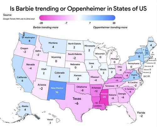
Digital Humanities -- "Is Barbie or Oppenheimer Trending More?" -- Oscar Nobel
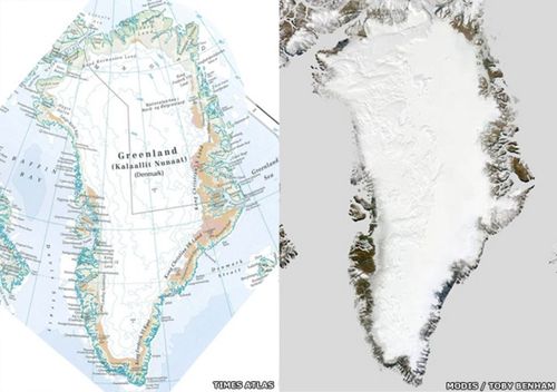
43
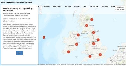
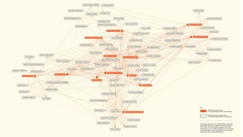
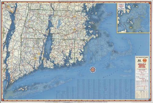
Digital Humanities – Frederick Douglass Lectures in Britain and Ireland - Jeff Sousa
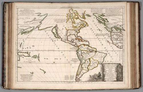
44
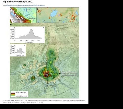
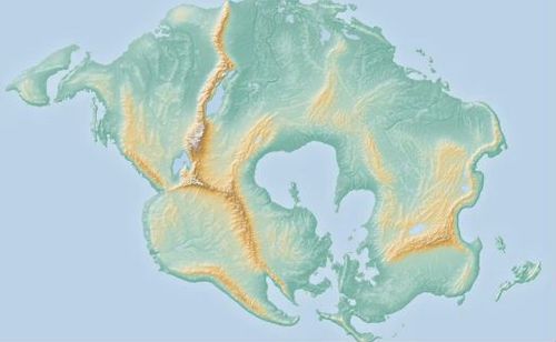
Digital Humanities – Lidar Imaging in the Bolivian Amazon - Jeff Sousa
45
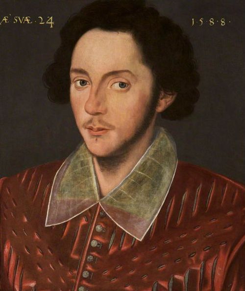
Digital Humanities - Shakespeare Facial Recognition - Nikhil DeNatale
46
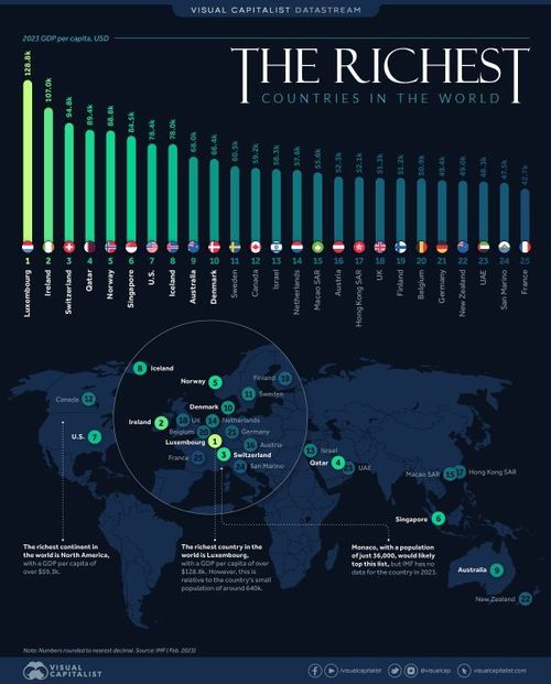
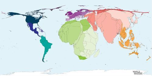
Digital Humanities - Top Countries by GDP per capita - Denis Sotnichenko
47
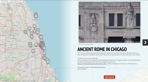
Digital Humanities - Ancient Rome in Chicago - Nathan Moldavsky
48
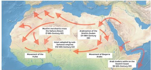
Digital Humanities - The Spread of Islam in Ancient Africa - Fletcher Hoven
49
Digital Humanities - Map for Katherine Dunham’s Repertory- Fletcher Hoven
50
Digital Humanities - Inventing Abstraction - MoMA 2012-2013 - Joe Miotto
51
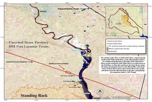
Digital Humanities - "Digitizing the Sacred: Water, Struggle, and the Digital Legal Geography of Standing Rock" - Julian Arenas
52
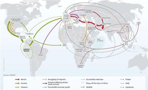
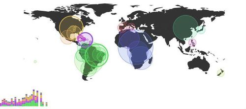
Digital Humanities - Map of crime worldwide. (United Nations Office on Drugs and Crime) - Barrett Heritage
53
![[ 2024-12-31 23:07:16 ]](https://iiif.pixeum.org/iiif/3/1735686448/full/500,/0/default.jpg)
[ 2024-12-31 23:07:16 ]
54
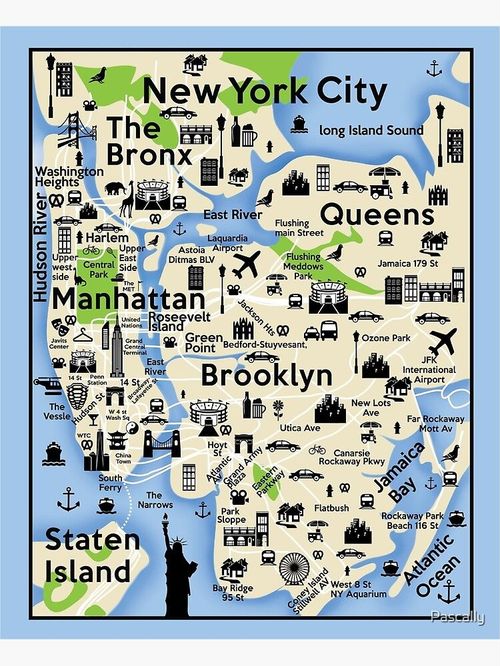
Bad Design - "New York, City Map, Brooklyn, Queens, Manhattan, Staten Island, Bronx, sites, City Greeting Card" - Connor Connolly
55
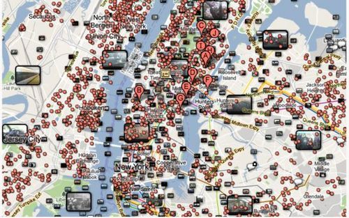
Bad Design - New York City "Mashup" - Chris Malone
56
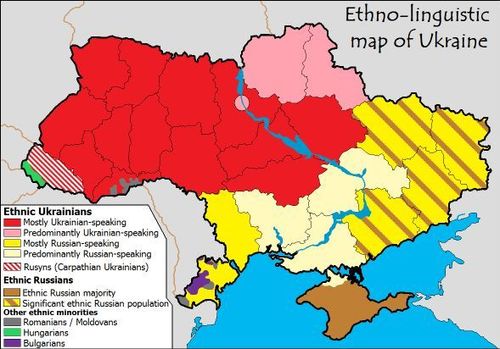
Bad Design - Ethnolinguistic Map of Ukraine - Andrew Gu
57
Bad Design – The 1972 Massimo Vignelli map of the New York subway - Orr Teva
58
Bad design - Most famous celebrity from each state - Teddy Palmore
59
Bad Design -- "Super Bowl Wins by Country" -- Oscar Nobel
60
Bad Design - The map of economic activity of Moscow Region - Denis Sotnichenko
61
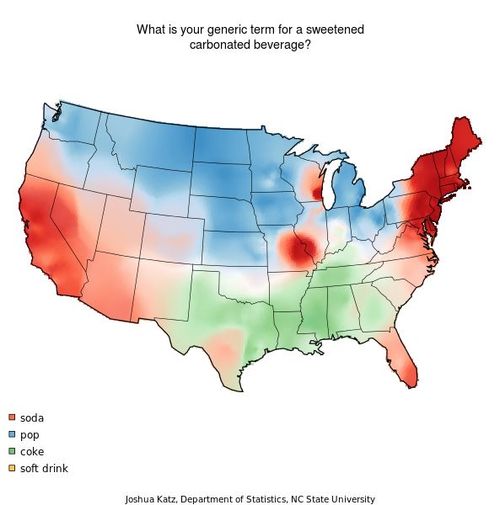
Bad Design - What Is Your Generic Term for a Sweetened Carbonated Beverage? - (Brandon Joung)
62
Bad Design - Sam Reynoso Williams
63
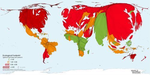
Bad Design - Ecological Footprint Map - Nikhil DeNatale
64
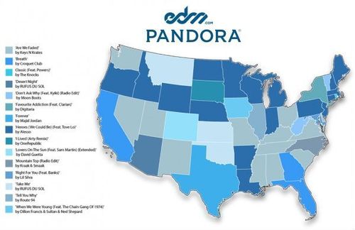
Bad Design - Top Pandora Tracks - Nathan Moldavsky
65
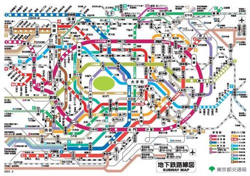
Bad Design - Tokyo subway map - Reona Kubomiya
66
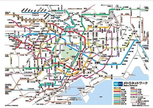
Bad Design - Tokyo subway map - Reona Kubomiya
67
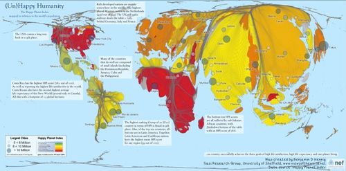
Bad Design – The Happy Planet Index - Jeff Sousa
68
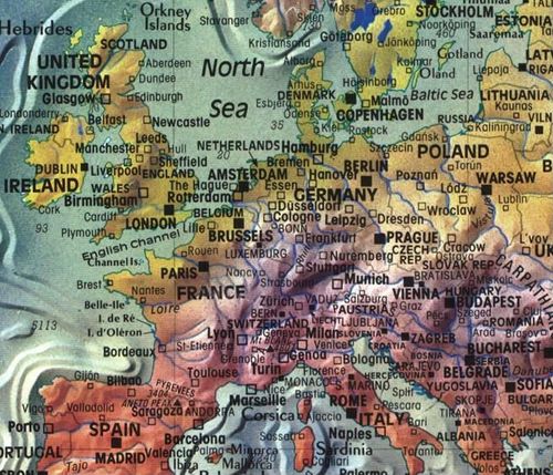
Bad Design - Map of Europe - Tayler Wise
69
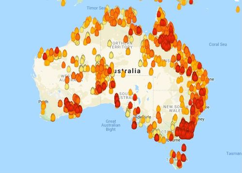
Bad Maps - Bush Fires in Australia - Fletcher Hoven
70
![Bad map: [Untitled] - Julian Arenas](https://iiif.pixeum.org/iiif/3/1705504236/full/500,/0/default.jpg)
Bad map: [Untitled] - Julian Arenas
71
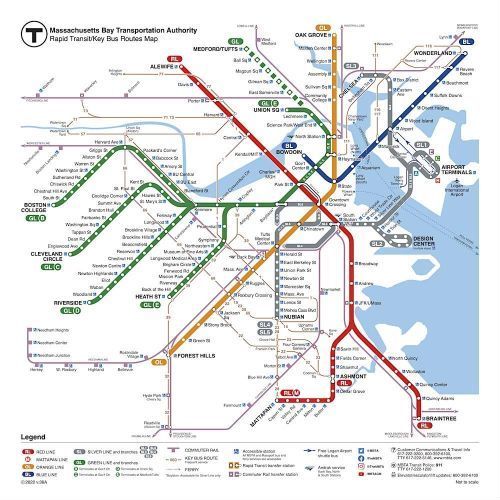
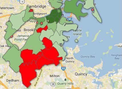
Bad Maps - Map of the T - Joe Miotto
72
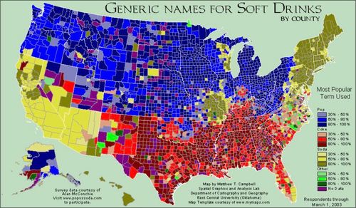
Bad Design - Generic Names for Soft Drinks by county (Aly)
73
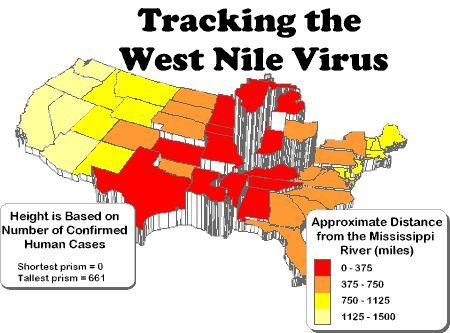
Bad Map - West Nile Virus - Barrett Heritage
74
Bad Design - Tom Paper (Katherine Myers)
75
![[ 2024-12-31 23:13:16 ]](https://iiif.pixeum.org/iiif/3/1735686804/full/500,/0/default.jpg)
[ 2024-12-31 23:13:16 ]
76
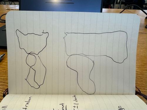
Self-Drawn Map - Tom Paper
77
Self-Drawn Map - Eleanor Bigeow
78
Self Drawn Map - From Memory - Jeff Sousa
79
Self-Drawn Map - Connor Connolly
80
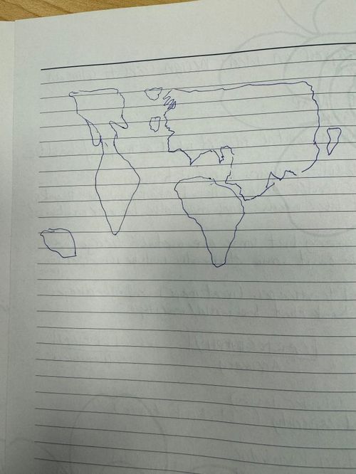
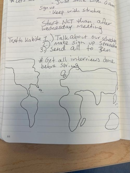
Self-Drawn Map - Brandon Joung - World Map from Memory (east half)
81
Self-Drawn Map - Brandon Joung - World Map from Memory (west half)
82
![[ 2024-12-31 23:15:47 ]](https://iiif.pixeum.org/iiif/3/1735686957/full/500,/0/default.jpg)
[ 2024-12-31 23:15:47 ]
83
Speculation – Mountains of Kong Map Mistake - Orr Teva
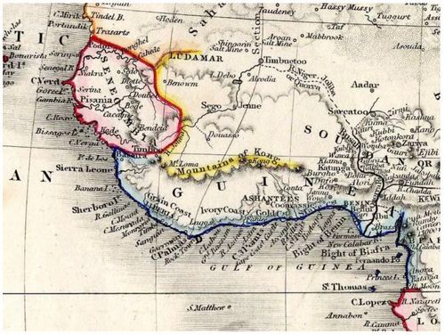
84
Speculation - Iraqi WMD - Chris Malone
85
Speculation - Kingdom of Soissons - Andrew Gu
86
Speculation - "Map of Malaysian Air Flight 370" - Connor Connolly
87
Speculation -- "Population Year 2100" -- Oscar Nobel
88
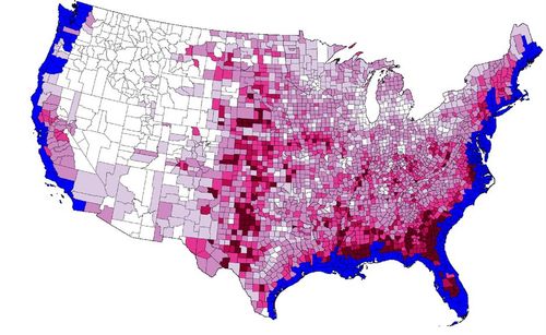
Speculation - Map of sea level in 2100 - Denis Sotnichenko
89
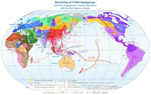
Speculation - Y-DNA Haplogroups & Migration Routes - Brandon Joung
90
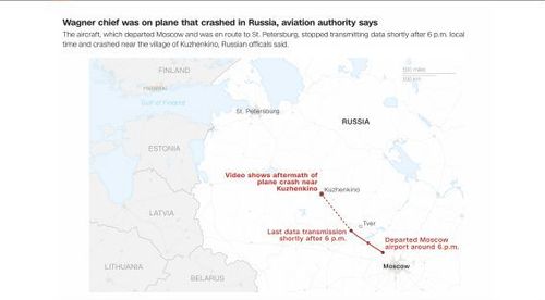
Speculation - Wagner Plane Crash Investigation - Nathan Moldavsky
91
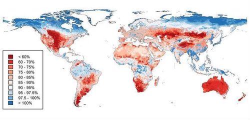
Speculation - Biodiversity Loss Around the World - Nikhil DeNatale
92
Speculation – Provincetown Projected Sea Rise - Jeff Sousa
93
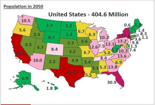
Speculation - U.S population estimate by 2050 - Fletcher Hoven
94
Speculation Map-SRW
95
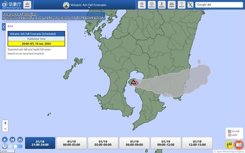
Speculation - Volcanic ash fall forecast of Sakurajima volcano - Reona Kubomiya
96
Speculation - Times Atlas Greenland - Tayler Wise
97
Speculation - MA, RI, & CT Petrofuture - Julian Arenas
98
Speculation - Sanson’s Map of Atlantis - John Steinmetz
99
Speculation - Pangea Proxima - Teddy Palmore
100
Speculation - Map of Sweden (Scandinavia) from the 1st century - Barrett Heritage
101
![[ 2024-12-31 23:29:35 ]](https://iiif.pixeum.org/iiif/3/1735687785/full/500,/0/default.jpg)
[ 2024-12-31 23:29:35 ]
102
![Tom Paper test [ 2023-12-22 05:51:13 ]](https://iiif.pixeum.org/iiif/3/1703224306/full/500,/0/default.jpg)
Tom Paper test [ 2023-12-22 05:51:13 ]
103
![[ 2023-12-22 14:57:47 ]](https://iiif.pixeum.org/iiif/3/1703257086/full/500,/0/default.jpg)
[ 2023-12-22 14:57:47 ]
104
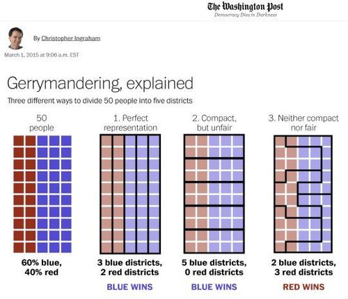
Gerrymandering - The Washington Post - 2015
105
![[ 2024-12-31 23:27:27 ]](https://iiif.pixeum.org/iiif/3/1735687659/full/500,/0/default.jpg)
[ 2024-12-31 23:27:27 ]
106
![[ 2024-12-31 23:26:19 ]](https://iiif.pixeum.org/iiif/3/1735687646/full/500,/0/default.jpg)
[ 2024-12-31 23:26:19 ]
107
![[ 2024-12-31 23:41:09 ]](https://iiif.pixeum.org/iiif/3/1735688479/full/500,/0/default.jpg)
[ 2024-12-31 23:41:09 ]
Place a DOT on the image