HIST23B - Student Projects - January 2024
Step 0 of 0
1
2
3
4
5
6
7
8
9
10
11
12
13
14
15
16
17
18
19
20
21
22
23
24
25
26
27
28
29
30
31
32
33
34
35
36
37
38
39
40
41
42
43
44
45
46
“E414 - your image title - cartographer - year published - your name”
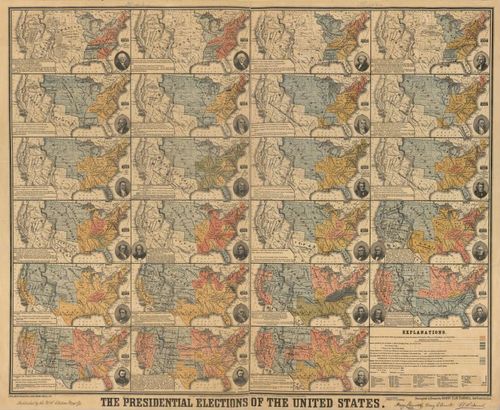
E414 - 1877 US Election Map (Chris Malone)
From the Library of Congress, an 1877 map by Henry Clay Donnell of the first 23 US elections. Great text about each election, as well as each map showing status of states and territories.
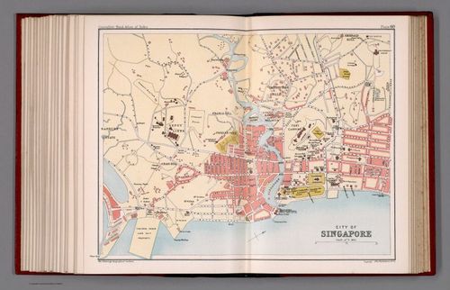
E414 - City of Singapore. Plate 60 - J.G. Bartholomew - 1893 - Brandon Joung
An 1893 map of the British colonial city of Singapore, by J.G. Bartholomew. Obtained from the David Rumsey Historical Map Collection.
Question: What did Singapore look like in 1893?
Logic: Aligned perpendicular to the mouth of the Singapore River.
System: General cartography, fit for atlas use.
Estimation: Precise, accurate location and orientation of streets, buildings, geographic formations both natural and man-made.
Design: Ink engraving. Color-coded legend --- buildings in red, parks in green, water in blue, roads in white, government and culturally significant buildings in black, undeveloped land in beige.
Iteration: 1893 version of a British atlas. Likely a tweaking of previous maps.
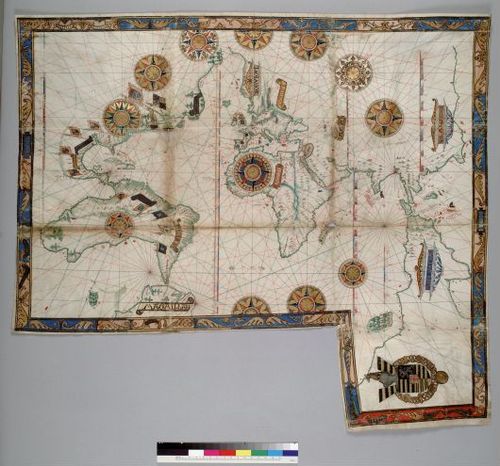
A world map by Guillaume Brouscon, an example of a Dieppe map, 1543. (Orr Teva)
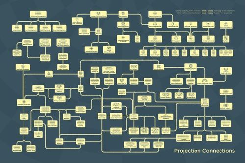
E414 - map projections - daniel huffman - 2022 (Barrett Heritage)
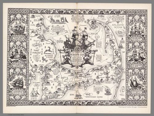
E414 - The Map of Cape Cod, Massachusetts - Coulton Waugh - 1930 - Jeff Sousa
Description: A 1930 decorative map of Cape Cod created by Coulton Waugh. This map provides major town and village names, as well as locations and short descriptions of historical discovery/shipwreck locations around the coast of Cape Cod. The map appears to build off of Waugh's earlier decorative map of Cape Cod which he created in 1926. Waugh was a proud resident of Provincetown when he created this map. Much of the iconography, such as the image of the Rose Dorothea schooner, is a nod to Provincetown.
Question: What are the important maritime related locations on Cape Cod?
Logic: Traditionally aligned map of Cape Cod and parts of the South Shore of Massachusetts. This map does not include Nantucket and Martha's Vineyard, which are often represented on maps of Cape Cod.
System: This decorative map, which appears to be hand-drawn, was likely based on earlier maps of Cape Cod.
Estimation: The coastlines of this map are remarkably accurate. The drawings of houses and structures on land are obviously inaccurate and only intended to be an artistic design, though some of the drawings represent real structures.
Design: Although this is an artistic decorative map, there is some element of design. The inclusion of ship routes and maritime points of interest helps to educate any viewer who is interested in Cape Cod maritime history.
Iteration: As mentioned, Waugh likely based his illustration on earlier maps of Cape Cod. The accuracy of his illustration seems to indicate that he was using the most updated versions of the map of Cape Cod. Furthermore, this 1930 map is very similar to another Cape Cod map illustration created by Waugh in 1926.
Map Source: From the digital collection of David Rumsey.
Voice Note/Description Source: Guadazno, Laurel. Provincetown Banner.
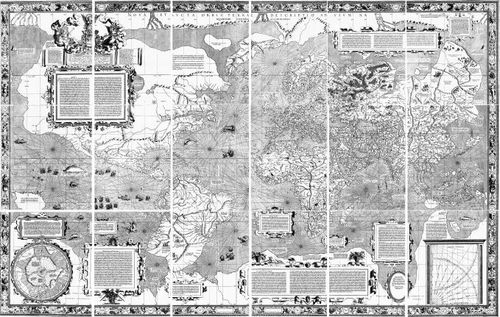
E414 - Mercator 1569 World Map - Gerardus Mercator - 1569 - Barrett Heritage
Question: how can navigation be simplified for sailors?
Logic: oriented with North at the top and all projected meridians parallel
System: mathematical projection of the globe to a cylinder
Estimation: distortion of relative size as latitudes deviate from the equator
Design: printed from engravings on copper sheets. First example of the Mercator Projection
Iteration: Many copies were made, but only two original copies are known to exist.
https://www.myoldmaps.com/renaissance-maps-1490-1800/400-diego-gutierrez-map/406-mercator-world-map.pdf
E414 - Da Qing Fensheng Yutu (Provincial Atlas of the Great Qing Dynasty) - Cartographer Unknown - 1754--1760 - Andrew Gu
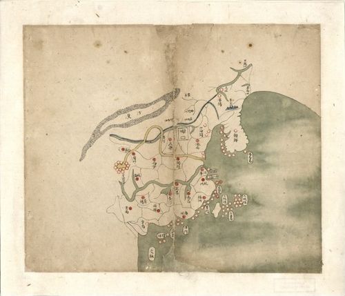
The first map in a 19-map provincial atlas. This depicts the 18 provinces of the Qing Dynasty of the period, and the subsequent 18 pages each depict one province in greater detail. Though the Qing and their predecessors had created more mimetic maps earlier, such as with the Yongzheng Atlas in the late 1720s, this map largely discards mimesis for political readability, focusing on provincial capitals, (abstracted) major geographic features, and borders (including both the Great Wall and recognizable provincial outlines).
Sources:
- https://www.loc.gov/resource/g7820m.gct00229/?sp=1
- https://en.m.wikipedia.org/wiki/File:Da_Qing_fen_sheng_yu_tu_LOC_2002626726-1.jpg
- https://muse.jhu.edu/article/796762/pdf
- https://blogs.bl.uk/asian-and-african/2019/04/a-jesuit-atlas-of-asia-in-eighteenth-century-china.html
- https://www.jstor.org/stable/48547830
Very useful source (an annotated map): https://commons.wikimedia.org/wiki/File:Da_Qing_fen_sheng_yu_tu_LOC_2002626726-1.jpg

An astoundingly accurate and detailed map (its separate pages collated on page 89 of this 2017 article by Mario Cams) produced by a joint Qing-Jesuit effort under emperor Kangxi in 1717-1721, decades before this provincial atlas. This cartographer made a conscious choice to avoid mimesis.
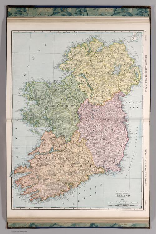
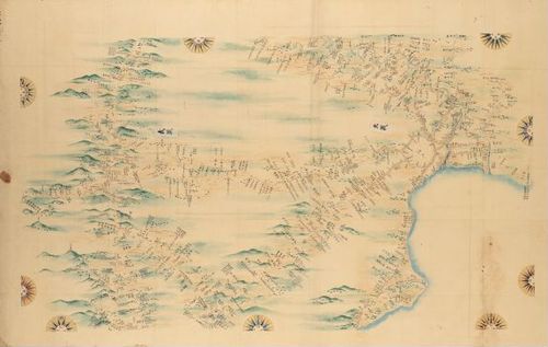
Rand McNally and Company: Ireland (The Library Atlas of The World)
The island of Ireland as it appeared in 1912, before the formation of the Republic of Ireland.
Target area as viewed 08-01-24 via OSM:

-- Data Provided by David Rumsey Map Collection --
Author Rand McNally and Company
Date 1912
Short Title Ireland.
Publisher Rand McNally and Company
Publisher Location Chicago
Type Atlas Map
Obj Height cm 70
Obj Width cm 50
Scale 1 728,640
Reference P3637b.
Country Ireland
Full Title Ireland.
List No 2790.320
Page No 51-52
Series No 320
Publication Author Rand McNally and Company
Pub Date 1912
Pub Title The Library Atlas Of The World. A Reference Work In Two Volumes, Containing Over Two Hundred Maps And A Complete Index. Rand McNally & Company Publishers, Chicago, New York. Volume I - United States. Volume II - Foreign Countries. (on verso) Copyright, 1912, By Rand, McNally & Company.
Pub Reference P3637b.
Pub Note Has relief maps of U.S. states and Continents. The relief maps here are on separate pages - they also appear in the 1908 Indexed Atlas of the World, but put in the text pages and surrounded by text. Full printed color. In volume 1, individual map titles typically begin, "The Rand McNally New Commercial Atlas Map of". State maps include list of railroads which are keyed to map. In volume 2, individual map titles typically begin, "The Rand McNally New Library Atlas Map of". The (International) "Index to Maps" portion of the atlas was not scanned.
Pub List No 2790.000
Pub Type World Atlas
Pub Maps 207
Pub Height cm 53
Pub Width cm 40
Image No 2790320.jp2
Download 1 <a href=https://www.davidrumsey.com/rumsey/download.pl?image=/179/2790320.jp2 target=_blank>Full Image Download in JP2 Format</a>
Download 2 <a href="https://www.extensis.com/support/geoviewer-9" target="_blank">GeoViewer for JP2 and SID files</a>
Authors Rand McNally and Company
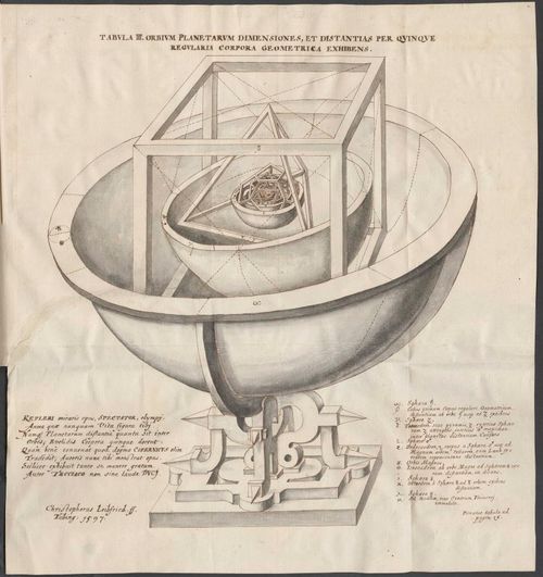
Kepler's Platonic solid model of the Solar System from Mysterium Cosmographicum (Oscar Nobel)
Mysterium Cosmographicum ("The Cosmographic Mystery") by Johannes Kepler
Johannes Kepler (1571 - 1630):
- German astronomer, astrologer, mathematician, musician, and philosopher (renaissance man)
- Extremely influential
- Issac Newton's law of universal gravitation
- NASA's Kepler space telescope
- Wrote many books
- Astronomia Nova (1609)
- Harmonice Mundi (1619)
- Epitome Astronomiae Copernicanae (1618-1621)
- Mysterium Cosmographicum (1st 1596, 2nd 1621)

Source: Wikipedia
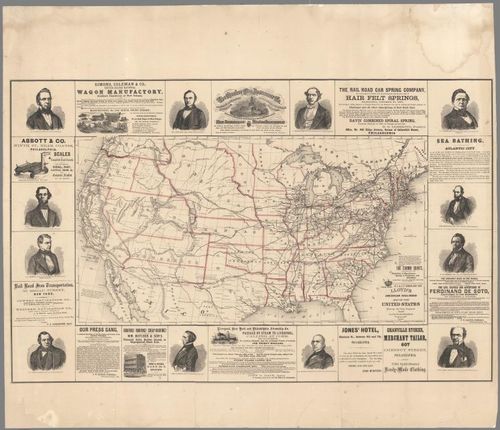
E414 - Lloyd's American Railroad Map of the United States - James T. Lloyd - 1859 - Teddy Palmore
Q: This map seeks to answer the question: "Where do proposed railroads and overland mail routes run in relation to the existing railroad infrastructure in the United States?"
L: Shows the entire country's railroad system, allowing potential train customers to map out the routes they will be able to take to the Pacific when the railroads are complete
S: Surveying of existing railroad infrastructure in order to map, knowledge of western terrain to know where railroads can pass
E: Routes of the railroads have been simplified for ease of comprehension
D: printed outlines, hand-colored, mounted on linen
I: Slight variation of map reproduced used to advocate for congressional approval of railroad line
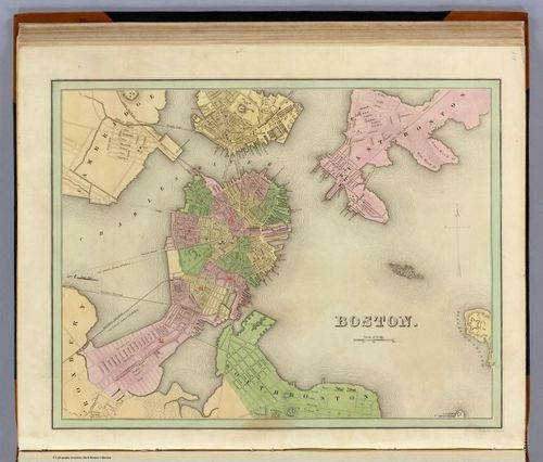
City of Boston(A General Atlas Of The World, With A Separate Map Of Each Of The United States Of America.)-Goodrich, S.G. ; Bradford, Thomas G.-1841-Sam Reynoso Williams
An 1841 map of Boston by Thomas G Bradford and Samuel Griswold Goodrich illustrating aspects of the Boston. Boston neighborhoods are labeled by number.
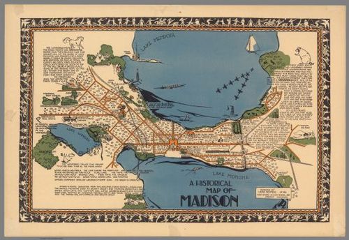
A Historical Map of Madison by Laura Kremers (1924) Julian Arenas
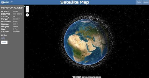
Estimated from 1924
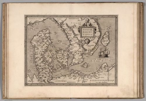
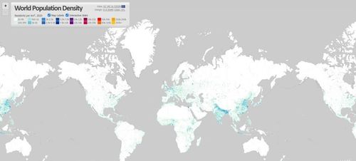
E414 - Daniae - Ortelius - 1570 - Nathan Moldavsky
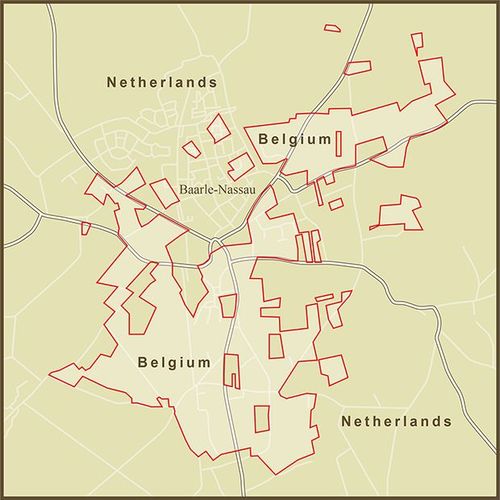
Q: How does Ortelius draw on multiple cartographers to best illustrate Denmark in an accessible way?
L: Ortelius seems to apply the general concepts of latitude and longitude (on the perimeter of the map) and a scale at the bottom right to make distance approximations.
S: Previous cartographers' accounts of the region were synthesized to make the map, but copper printing plates were used for mass distribution of the atlas to primarily middle-class consumers.
E: The shape of Denmark is horizontally stretched out more than its actual shape, the vertices of some of the mainlands are slightly inaccurate, and some of the islands seem to be drawn out of speculation (several islands don't actually exist).
D: Ortelius curated 53 bundled maps in his atlas and designed them to all be the same size and style using copper plate templates.
I: After this specific map was published, Ortelius continued to make changes up until his death. Several colorized versions also exist today.
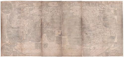
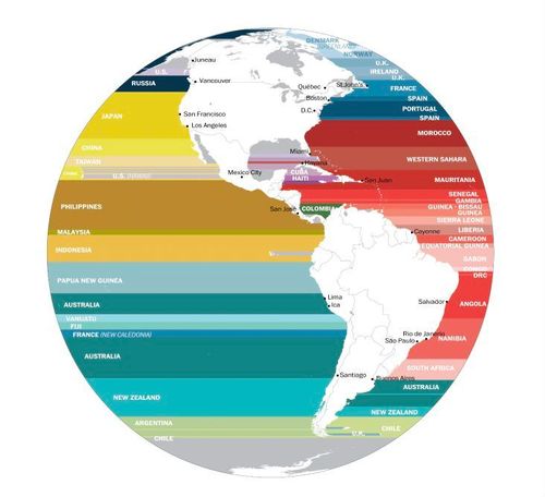
1602 Kunyu wanguo quantu (Map of the Ten Thousand Countries of the Earth)- Matteo Ricci
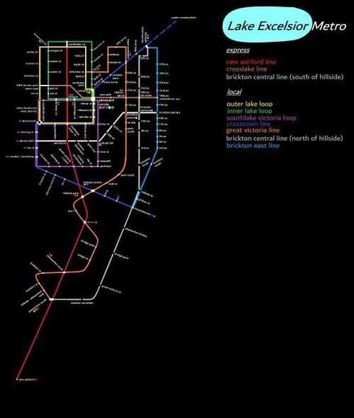
Kunyu wanguo quantu, (坤舆万国全图) or Map of the Ten Thousand Countries of the Earth, is the oldest known Chinese map to show the Americas. Created in 1602 by an Italian Jesuit Missionary Matteo Ricci and Chinese translators and cartographers, including Li Zhizao. It was printed by an official printer of the Ming Dynasty Court, intended for the emperor. It was printed on six panels of wodden block, totaling about (12 feet by 6 feet).
Currently only about 12 copies in the world, 2 that are in good condition. Most copies are in the Vatican and Japan.
Ricci was the first documented Westerner to enter Peking, (Beijing) bringing atlases of Europe and the West that were unknown in China. He exchanged with the Chinese maps of the East that were equally unfamiliar to Western scholars, so this map represents the first cartographic collaboration between Western and East Asian scholars. It was widely circulated in Japan and Korea and had a significant influence on scientific and geographic understanding at the time.
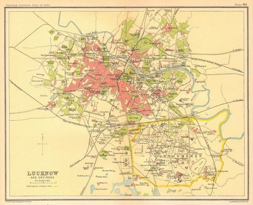
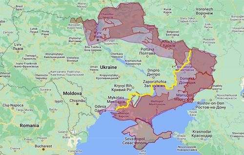
Lucknow, India 1931 Print, Imperial Gazetteer - Joe Miotto
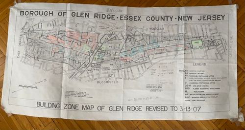
Originally was published in 1931 in The Imperial Gazetteer of India by Clarendon Press. This is a folding map showing the city and cantonment in Lucknow, which was a major player in the Indian Rebellion/Sepoy Mutiny of 1857. There are two distinct regions on the map, the Indian city, and the British Cantonment. Cantonments were designed by the British to operate completely independently of the Indian cities. They had their own houses, trading posts, hospitals, and training grounds. All of this was typically surrounded by large walls to maintain the separation between the oppressed and the oppressor.
This map is not a rare map. On the website I found it being sold for around 30 euros. I was interested in this map since it relates to my previous architectural studies of the British Raj, cantonments, and hill stations.
Link; https://www.antiquemapsandprints.com/product/lucknow-town-city-plan-cantonment-and-key-buildings-british-india-1931-old-map/P-6-018176~P-6-018176
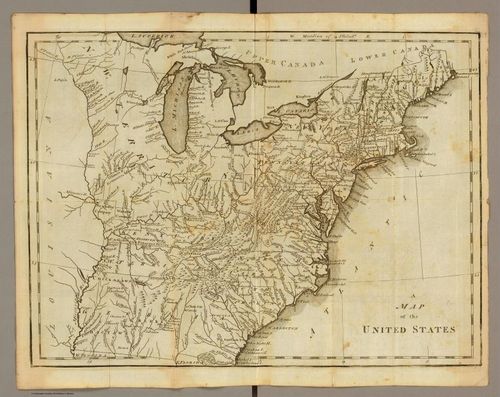
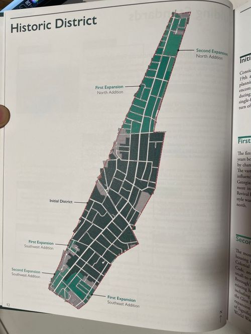
A Map of the United States, Joseph Scott, 1795
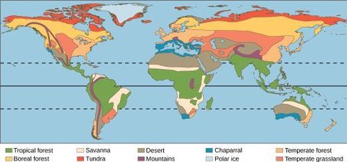
This map is from an atlas Maps of the United States published by Joseph Scott in 1796.
Map obtained from the David Rumsey Map Collection.
https://www.davidrumsey.com/luna/servlet/detail/RUMSEY~8~1~34657~1180272:michigan?annotId=301684827#
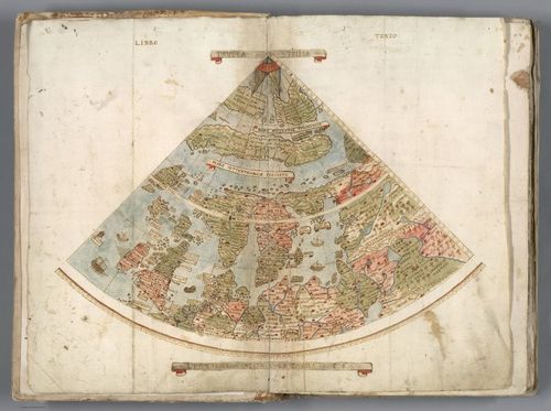
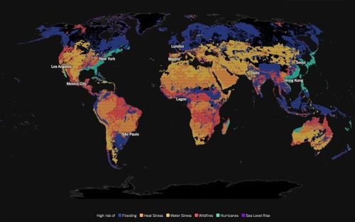
Tavola Prima. Libro Terzo - Denis Sotnichenko
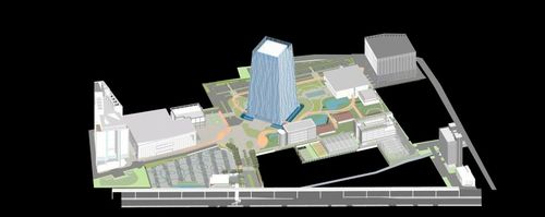
This is the map of the nothern polar region of the globe cretaed by the carographer Urbano Monte from Milan, Italy in 1587. There are 3 etants of this map and this is the printed one. The other two are manuscripts.
“An important and extraordinary manuscript world map drawn up on a north polar projection to form the largest manuscript map of the world at 9 by 9 feet. " (Source [1])
It is a part of the Minto's big world map:

Sources:
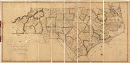
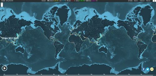
The First Actual Survey of the State of North Carolina. x.af;ljsadf;lkjsadf;lkjdsafafds;lkjasdf;lkajfsa;ldsjfad;lkfjad;lkfjdsf;lkjfds;lajdfa;ldskjfads;lkfja
Published in 1808 by Jonathon Price, John Strother, and William Harrison. Map depicts North Carolina during the early 1800s. The map shows cities, towns, natural features, churches, Quaker Meeting Houses, roads, and canals. The map is depicted pictorially and by hachures - short parallel lines used in hill-shading on maps, their closeness indicating steepness of gradient. Towards the West end of the map it reads, "boundary's not yet settled" as this area of North Carolina had not yet been explored. The biggest thing I noticed when looking at this map is that there are far more counties/sections in North Carolina now then there were. North Carolina has since been completed on more recent maps, as well.
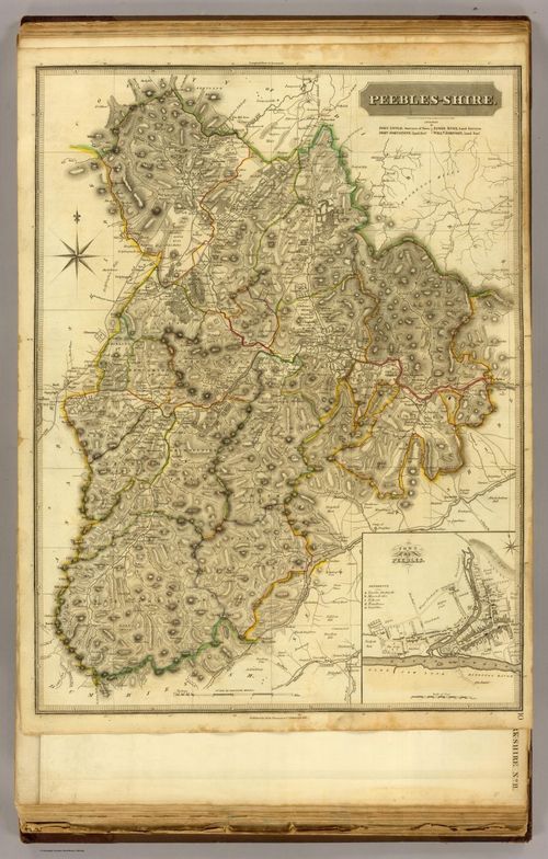
E414: Peebles-Shire, John Thomson, 1832, (Fletcher Hoven)
Peebles Shire, Scotland.
This map shows an in depth view of Pebbles, a former royal burgh, in southeastern Scotland.
Starting in the early 18th century, Scotland was part of the British Union for political and economic reasons. Detailed atlas maps of Scotland were developed in the 18th century. However, as the territory was becoming more established, an Atlas maps were created primary for the royal army to secure the less known places of Scotland.
From 1830s to the mid Twentieth century, unemployment, poverty, and persecution caused an influx of immigrants to Scotland from Ireland, Italy, and Eastern Europe. They fled in hope for a better life.
E414 - Maps of Japan's Coastal Area (#90 of large-scale maps) - Tadataka Ino et al. - 1821 - Reona Kubomiya
Image source: https://ja.wikipedia.org/wiki/%E5%A4%A7%E6%97%A5%E6%9C%AC%E6%B2%BF%E6%B5%B7%E8%BC%BF%E5%9C%B0%E5%85%A8%E5%9B%B3
This is an early 19th century map of the present Tokyo area, taken from the series called Maps of Japan's Coastal Area (ja: 大日本沿海輿地全図) also known as Inos's maps after its leading cartographer and surveyor Tadataka Ino. The project begun in 1800 as his private project, and after, the shogunate started to support his team realizing its importance in national defence. They spent 16 years surveying the coastlines all over the country (and some important inland roads as well), and finally completed all the maps in 1821.
All of 3 small-scale maps combined:

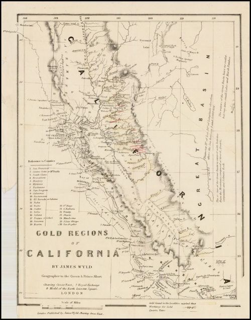
E414 - Gold Regions of California - James Wyld - 1852 - Tayler Wise
This is a map of the Gold Regions of California and was published in London my James Wyld in 1852. He was appointed geographer to Queen Victoria and Prince Albert. It shows the California gold regions, ranging from Mission San Gabriel and the Santa Barbara Channel in the south to Cape Mendocino and the Pyramid Lake Area in the north. It is drawn from his Map of the Gold Regions of California Compiled from Original Surveys, published in 1849 and appeared in his rare work, Notes on the Distribution of Gold through the World, including Australia, California, & Russia, published in 1852. This is an updated version of Wyld's 1849 map, and this version includes 26 California counties and gold-bearing quartz veins. The 1849 map was found in the Library of Congress, while this map was found in Stanford Libraries. https://exhibits.stanford.edu/mining/catalog/jr186th2536
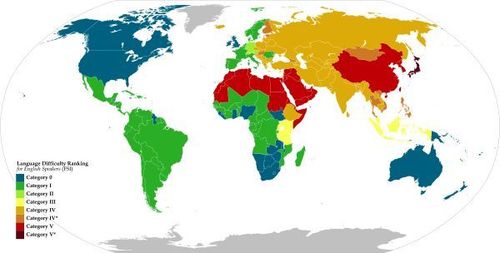
Language Difficulty Ranking for English Speakers - Nagihuin - 18 March 2022 - (Brandon Joung)
This 2022 map was obtained from data from the United States Foreign Service Institute (FSI). It categorizes the official languages of each country in the world by its difficulty for native English speakers (particularly from the US) to gain working proficiency in.
Some things I would wish to see/know:
The difficulty of languages that are not a country's official, especially in Africa and the Americas (this shows the intent/audience of this map, which are tourists or expats)
What defines difficulty (Vocabulary? Grammar? Script? etc.)
Map Source: https://commons.wikimedia.org/wiki/File:Language_Difficulty_Ranking_for_English_Speakers_%28FSI%29.svg
Data Source: https://www.state.gov/bureaus-offices/under-secretary-for-management/foreign-service-institute/
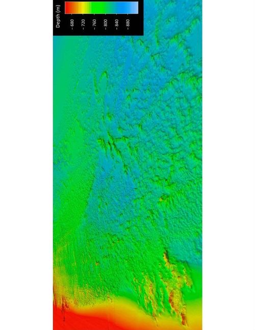
E414 - Mound Bathymetry Hires - Chris Malone
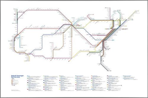
E414 - Amtrak Passenger Rail Service - Cameron Booth - 2023- Chris Malone
Source: davidrumsey.com
This is a subway diagram-styled map of Amtrak's passenger rail network from 2023. The designer, Cameron Booth, created the original version in 2010 and has updated it every few years thereafter. The updates include adding and deleting stations to keep it current as well as design modifications to make it more user-friendly. Similar to the London tube map, it focuses more on intelligent, harmonious spacing of stations rather than geographical exactness.
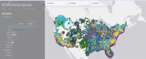
E414 - US Electricity sources - Carbon Brief (Simon Evans and Rosamund Pearce) - 2017 - Orr Teva
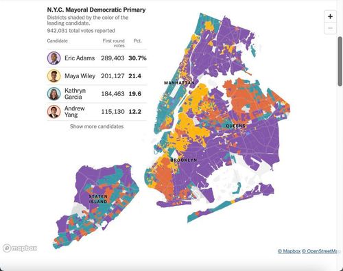
"The Most Detailed Map of New York City Mayoral Primary Results" -- The New York Times (Oscar Nobel)
An extremely detailed map of the New York City 2021 Democratic Primary election results, broken down by each individual election district. The map displays the first round of results only, not the final result, as the election was done with ranked choice voting, the first in the city's history to do so.
https://www.nytimes.com/interactive/2021/06/23/nyregion/nyc-mayor-primary-results-precinct-map.html
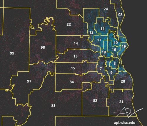
E414 - 2011 Milwaukee Legislative District Map - Caitlin McKown - 2023 - Nathan Moldavsky
https://wiscontext.org/packing-cracking-and-art-gerrymandering-around-milwaukee
L: Focuses on state assembly district lines in the Greater Milwaukee area to investigate gerrymandering techniques.
S: Uses voter data by party in the 2016 election across the 2011 designated legislative boundaries.
E: The mapmaker uses dots distributed randomly within each ward to represent votes rather than displaying every individual vote.
D: Uses digital software from the UW Applied Population Lab, census and voter data, yellow lines represent district boundaries, dots represent parties (blue = Democrat, red = Republican, yellow = Libertarian, green = Green)
I: Several versions exist to highlight certain aspects of the map, such as county lines and voter wards.
E414 - Satellite Map - Richie Carmichael - Active 2016-2022 - Jeff Sousa
Source: Satellite Map | Space Map Shows 19K+ Satellites Orbiting Earth (richiecarmichael.github.io)
Description: This is an interactive Satellite Map created by Richie Carmichael, an Esri developer of 22+ years. It claims to show satellites in space by country but does not specify whether these are active satellites or whether it includes every satellite ever launched (according to available data). Carmichael actually gives very little context or background info about this map and how he created it.
Question: How many satellites are in space and where are they?
Logic: This map is an interactive 3D model of Earth. Carmichael used this model to enable the viewer to rotate the earth and zoom out wide to se all satellites in near and far orbit.
System: Carmichael gets most of his data from online opensource resources, such as NASA and N2YO. As an Esri developer, he takes this data and creates his own map.
Estimation: Carmichael clearly uses estimation in where he chooses to place each satellite on the map and how he chooses to represent the line of orbit. These factors are constantly changing in real time.
Design: I don't initially see any design-related purpose for this map, considering it doesn't specify whether these are active or historic satellites. This seems to be a fun project to test Esri capabilities.
Iteration: It seems that Carmichael started this project in about 2016 and continued to work on it until 2022. It's not clear how many data sets Carmichael had to use to make this map.
E414- World Population Density - 2020- Fletcher Hoven
Description: This image is a map of the entire earth. This map has an interactive feature that shows population density of essentially every part of the world. This feature also shows the population in the year 1980, 2000, 2020, and the 2030 estimation. Another cool part of this feature is that it ranks each country and city on a global population level.
Question: How densely populated are certain cities and countries and how does it compare globally?
Utilization: This map can be used for many businesses that need to know population of a certain areas. While it does show a rough estimate of population density on a small scale, you cannot identify each district within states. Therefore I can see this map being used on a broad scale globally for a business relies on selecting locations that are more heavily populated.
Source: Luminocity
E414 - Baarle-Nassau and Baarle-Hertog - Andy Proehl - 2018 - Barrett Heritage
Question: Where are the boundaries of the Netherlands and Belgium?
Logic: This is an artistic map highlighting the complexity of the border between the Netherlands and Belgium.
System: The exact method of data collection is not made available, but the treaty defining the set of borders is based on lot ownership and historical allegiances. This map differs slightly from what is depicted on Google Maps, most notably at dot 1, where a region of the Netherlands is omitted.
Estimation: Unclear.
Design: Artistic interpretation.
Iteration: One and done.
E414 - What's Across the Ocean? - Weiyi Cai - 2015 - Teddy Palmore
Q: What country is directly across the ocean from you when you're on the coast in the Western Hemisphere?
L: Shows a band with vertical width showing how much of a coastline is taken up by a certain country across the ocean from it
S: Globular map projection
E: Width of smaller bands (to fit text on them)
D: Uses different color groups for different continents
I: Version of similar map that shows only Western Hemisphere
Connor Connolly - Lake Excelsior Metro
This is a fictitious metro map for a city I made in Cities Skylines.
For the full exhibit of Connor's maps, see https://www.pixeum.org/exhibits/462/connor-connolly-maps
Borough of Glen Ridge NJ Municipal Building Map - John Steinmetz
Glen Ridge NJ Historic District Map - John Steinmetz
Nikhil DeNatale - Biomes Map
A map of the world and the different biomes in each region. The equator, the Tropic of Cancer (the northern tropic), and the Tropic of Capricorn (the southern tropic) are also shown.
https://courses.lumenlearning.com/suny-monroe-environmentalbiology/chapter/3-3-terrestrial-biomes/
Climate risks around the world. Aly
E414 - TARA Office Building Drawing - Plan Associates 2021 - Joe Miotto
E414 - The map of cargo ships in the word - Klin - 2012 - Denis Sotnichenko
Source: https://www.shipmap.org/
The map shows the movements of ships in the ocean througout the 2012 year. The ships are marked by colour depending on the types of good being trnasported. The statictics of trnasported good can be seen in the upper part of the website.
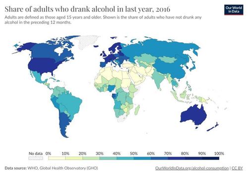
Who Drank in the Last Year(2016) Map-Sam Reynoso Williams
This map depicts the percentage of adults per country who drank alcohol in 2016. Luxembourg and Ireland topped the charts with 92% and 82% of adults drinking alcohol. Some countries such as Greenland and South Africa do not have data included. The percentages were determined by the WHO and Global Health Observatory (GHO).
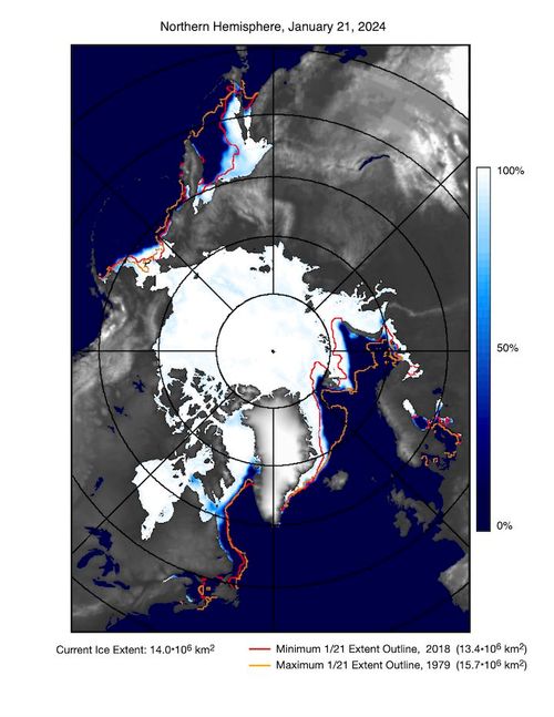
E414 - Current State of Sea Ice Cover - J. C. Comiso, C. L. Parkinson, T. Markus, D. J. Cavalieri, R. Gersten - 2024 - Tayler Wise
This map shows the current state of Arctic sea ice coverage (as of 1/19/2024) and compares it to years with the least and greatest extent since 1978 from the same date. This idea is relevant to current climate change trends, as there is a significant decrease in sea ice in the Arctic since 1978. The results from this map also indicate that this melt is likely amplified by the ice-albedo feedback. Sea ice concentration is defined as the percent areal coverage of ice with at least 15% ice concentration for a given grid cell. This map uses a satellite-based data record since 1978.
https://earth.gsfc.nasa.gov/cryo/data/current-state-sea-ice-cover
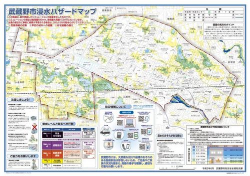
E414 - Flood hazard map of Musashino City, Tokyo - June 2023 - Reona Kubomiya
This is a flood hazard map of Musashino city, Tokyo.
Source: (link)
QLSEDI
Q: This map visually presents which areas of the city and to what extent will be flooded during typhoons or other heavy rains. It also includes information on what to watch out for during heavy rainfall and a description of the warning system, along with a legend.
L: The simulation results (depth of inundation) for the expected heavy rainfall are shown in color for each 10m x 10m section. The locations of outdoor speakers and city hall and offices are marked.
S: This map is created by Disaster Prevention division of the Musashino City, based on the inundation simulation by Tokyo Prefecture and basal map by Geospatial Institute of Japan. It is available in PDF format from the city's website, or printed and distributed at city hall and other locations.
E: The weather conditions are artificially set and inundation conditions are derived from simulations. Since it is expected to serve as a basis for each individual's disaster preparedness and evacuation plan, it is a reasonable assumption to assume larger disaster in a realistic extent. I have no idea how accurate the simulation itself is.
D: This map is seemingly overload of information, but considering it is to be read in normal times and printed on a large sheet of paper, it is probably not a big problem.
I: This map focuses on flooding and there are separate informational maps for matters common to all types of disaster, such as location of shelters.
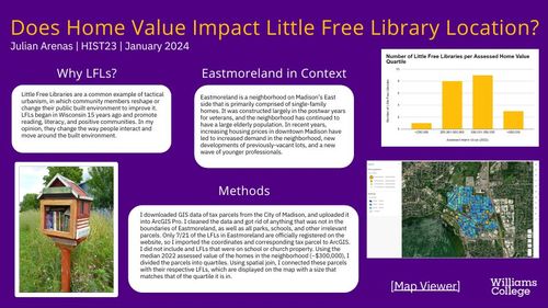
Does Home Value Impact Little Free Library Location?
By Julian Arenas
https://www.arcgis.com/apps/mapviewer/index.html?webmap=00df79d1ea804af394dd134f27cda61d
Place a DOT on the image


There is also a high degree of accuracy along the eastern U.S., such as around the Chesapeake bay and the islands of the coast of North Carolina. 


