

HIST23A - Student Projects - January 2023
Step 0 of 0
1
![[ 2025-01-01 19:45:20 ]](https://iiif.pixeum.org/iiif/3/1735760738/full/500,/0/default.jpg)
[ 2025-01-01 19:45:20 ]
2
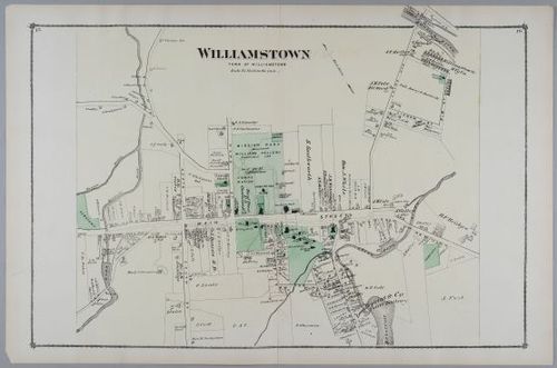
E316 - Williamstown Mass. home owners names 1876
3
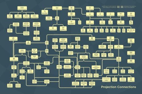
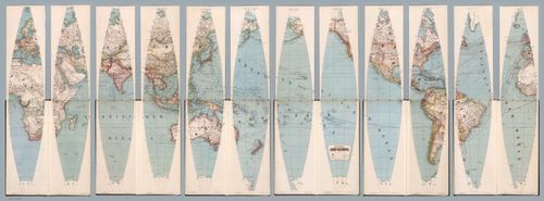
E316 - map projections - daniel huffman - 2022
4
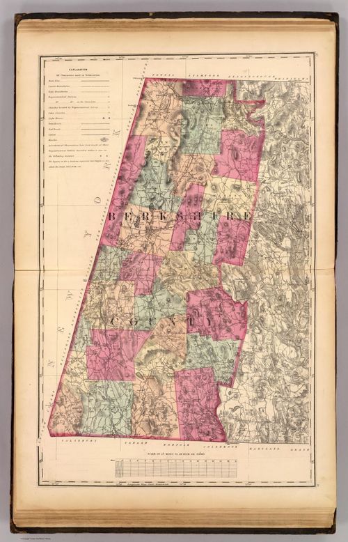
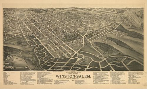
E316 - Berkshire County - H.F. Walling - 1871 (Joseph Grillo)
5
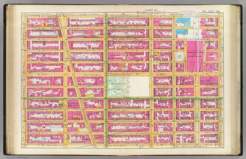
E316 - Wards 19-22 - Geo. W. & Walter S. Bromley - 1891 (Jacob Cohen)
6
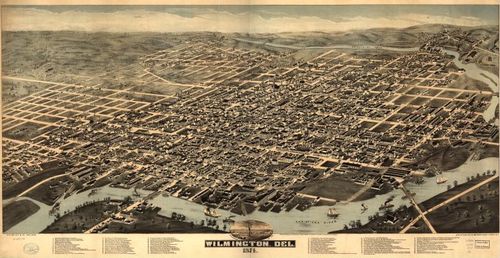
E316 - Wilmington, Del. 1874. - H.H. Bailey & Co. - 1874 (Donnie Morton)
7
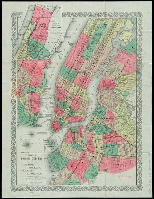
E316 - Strangers Mercantile Map of NY, BK, Jersey City, Hoboken, etc - G.W. & C.B. Colton & Co - 1890 (Audrey Liu)
8
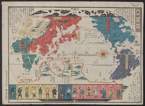
E316 - Picture of the World and its People - Bangkok Jinbutsu - 1825 (Ryan Guo)
9
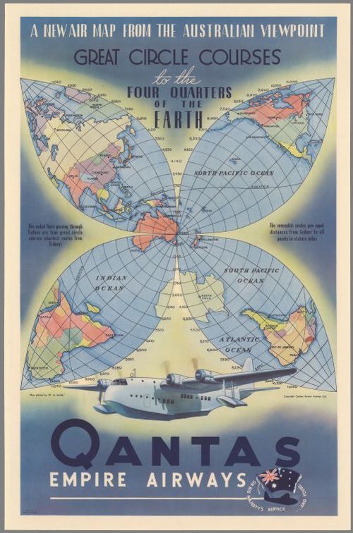
E316 - Qantas Airlines promotional map, Rhys Williams, 1938 (Harry Letterman)
10
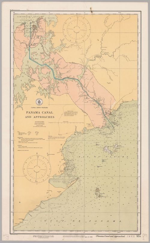
E316-Panama Zone-US Coast and Geodetic Survey-1914 (Simon Kent)
11
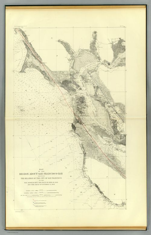
E316 - San Francisco Bay showing San Andreas Rift - California State Earthquake Investigation Commission - 1908 (Spencer Huang)
12
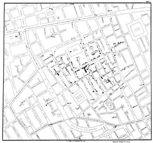
E316 - “On the Mode of Communication of Cholera” - John Snow - 1854 (Annie Gustafson)
13
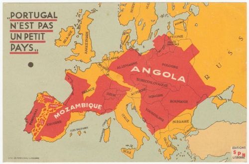
E316-Portugal n'est pas un petit pays-Galvao-1934 (Josh Rubel)
14
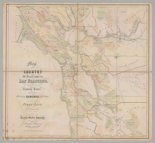
E316 - Composite Map: Henze's Erd-Globus - Adolf Henze - 1891 (Bradley St. Laurent)
15
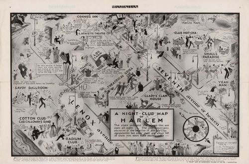
E316 - A Night-Club Map of Harlem - Elmer Simms Campbell -1933 - (Chiaka Leilah Duruaku)
16
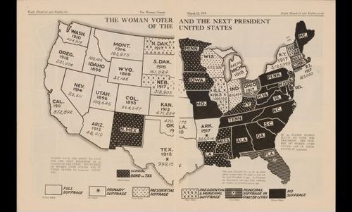
11670-E-316-The Woman Voter and The Next President (Stone Murphy)
17
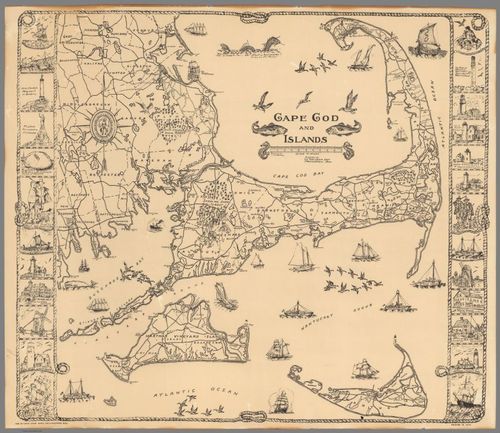
E316 - Cape and Islands - C.W. Holliday - 1934 (Toby Foehl)
18
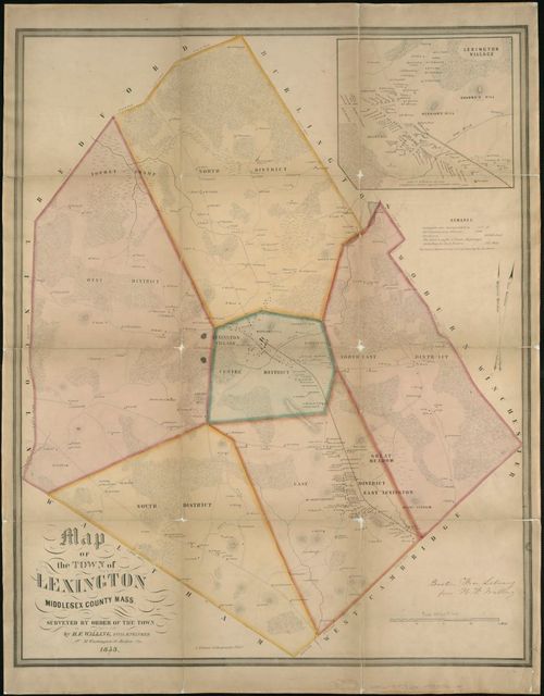
E316 - A map of the town of Lexington Middlesex County, Mass : surveyed by order of the town - Henry Francis Walling - 1853 (Cam Maguire)
19
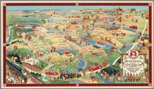
E316 - Great Northern Recreational Map - Joe Scheuerle - 1925 (John Skavlem)
20
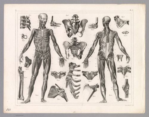
E316 - View: Plate 125. Anatomy including Ligaments and Muscles. - Johann Georg Heck - 1850 (Nicolas Figueroa)
21
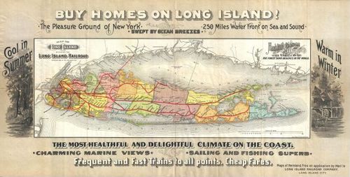
E316 - Long Island Railroad Real Estate Map of Long Island - LIRR - 1891 (David Cooper-Boyce)
22
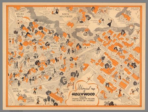
E316 - “Whimsical map of Hollywood showing Studios, Homes of the Stars and Points of Interest” - Allied Artists - 1937 (Luke Zanuck)
23
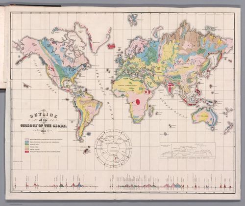
E316 - Outline of the Geology of the Globe - Edward Hitchcock - 1853 (Luci Ludwig)
24
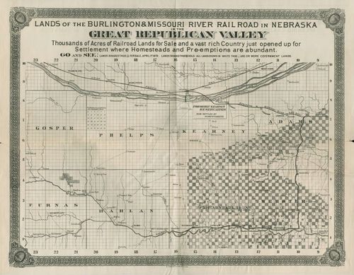
E316 - Map of the “Great Republican Valley” - Chicago, Burlington and Quincy Railroad - 1879 (Ella Marx)
25
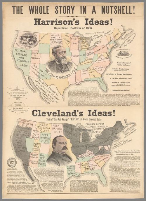
E316 - The Whole Story in a Nutshell! - Yale Publishing Co. - 1888 (Aidan O'Brien-Olwell)
26
E316 - Ruger & Stoner 1891 (Phillip Clifton)
27
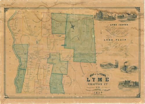
E316 - Map of the town of Lyme, Grafton Co., N.H.- W.C. Eaton - 1855 (Kennedy Lange)
28
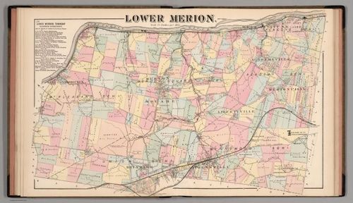
E316 - Lower Merion - G.M. Hopkins - 1871 (Elias Lindgren)
29
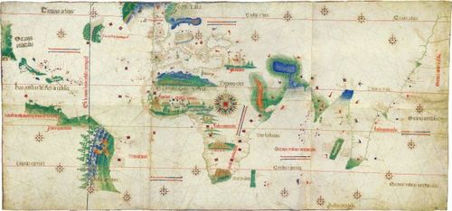
E316-Cantino Planisphere-Unknown Maker-1502 (Tommy Goodwin)
30
E316 - Map of SF Bay Area, Showing Land Grants and Counties - Leander Ransom - 1860 (Leo Marburg)
31
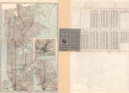
E316 - Hammond's subway system map of New York City - C.S. Hammond & Co. - 1921 (estimated) (Sam Wexler)
32
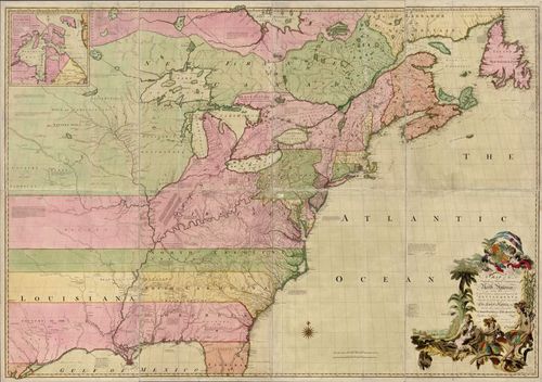
E316 - Map of 13 Colonies (Vaughn Sanders)
33
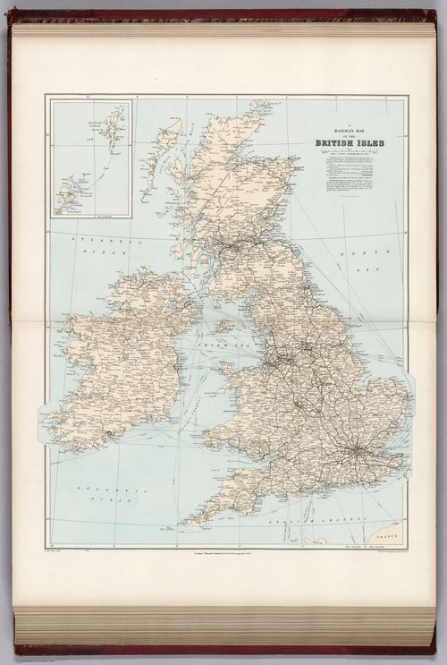
E316 - Railway map, British Isles - Edward Stanford - 1904 (Myer Liebman)
34
![[ 2025-01-01 19:45:39 ]](https://iiif.pixeum.org/iiif/3/1735760750/full/500,/0/default.jpg)
[ 2025-01-01 19:45:39 ]
35
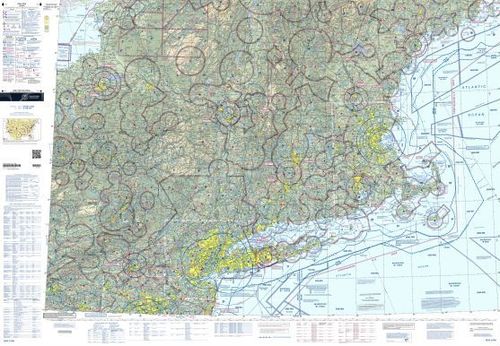
E316 - New York Sectional - FAA - 2022 (Jacob Cohen)
36
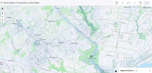
E316 - Strava Heatmap of Philadelphia Suburbs - Strava - 2023 (Elias Lindgren)
37
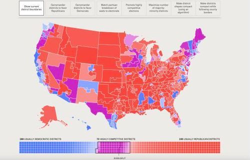
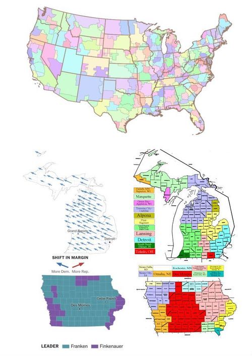
E316 -The Atlas of Redistricting (Josh Rubel)
38
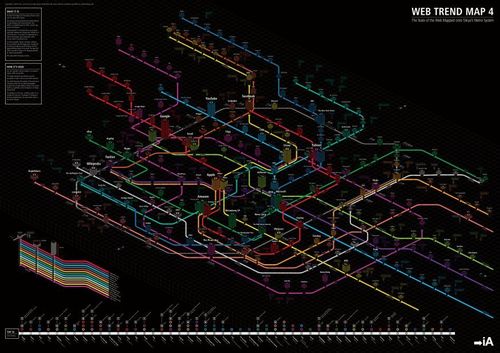
E316-Map of the Internet Information Architects (Simon Kent)
39
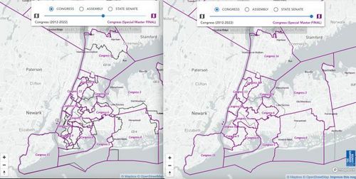
E316 - NY Redistricting & You (Audrey Liu)
40
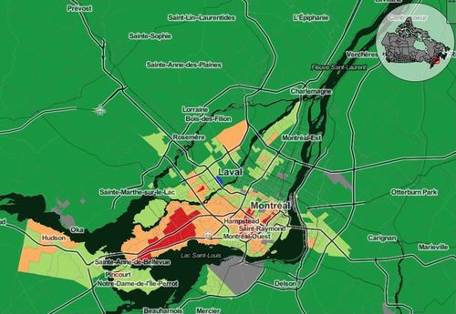
E316 - Linguistic Map of Montreal - censusmapper.ca/Patrick Murphy - 2016 (Ella Marx)
41
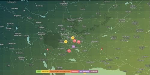
E316 - Guadalajara air quality map: Live air pollution map of Guadalajara (Nicolas Figueroa)
42
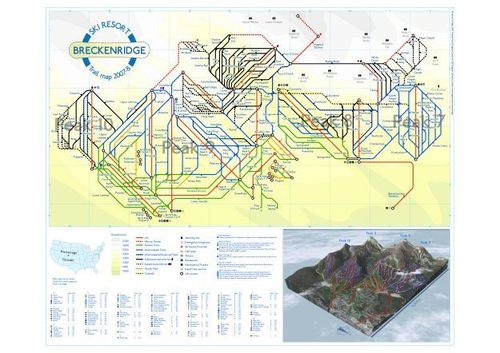
E316 - Breckenridge represented tube-style - Kenneth Field - 2007 (Annie Gustafson)
43
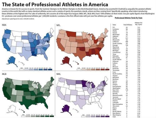
E316 - The State of Professional Athletes in America - Jacob Rude - 2014 (Donnie Morton)
44
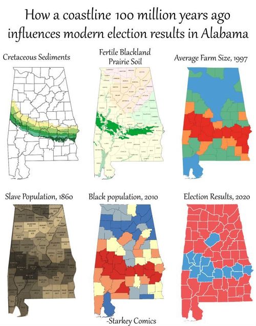
E316 - How a coastline 100 million years ago influences modern election results in Alabama (Ryan Guo)
45
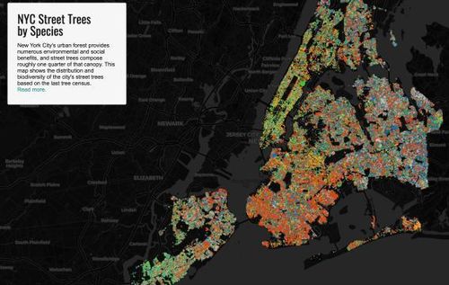
E316 - New York City Street Trees by Species - Jill Hubley - 2015 (Chiaka Duruaku)
46
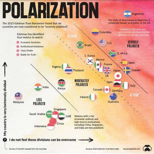
E316 - Which Countries Are Most Polarized? - Edelman & Visual Capitalist - 2023 (Tom Paper)
47
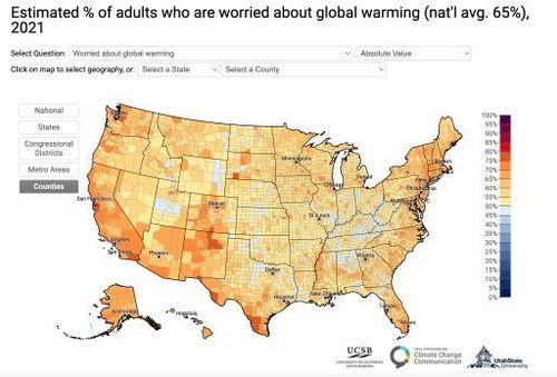
E316 - Yale Climate Opinions Map 2021 (Kennedy Lange)
48
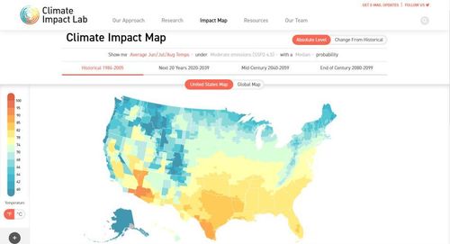
E316 - Climate Impact Map (Luci Ludwig)
49
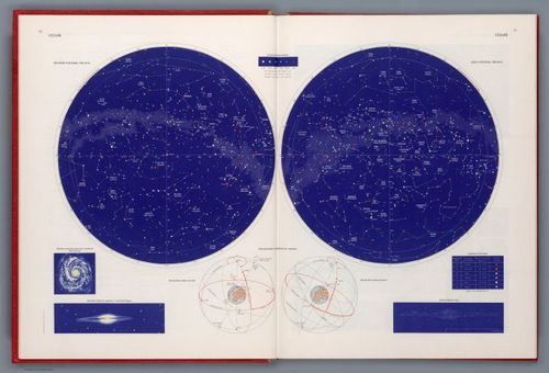
E316, Vesmir/The Universe (Harry Letterman)
50
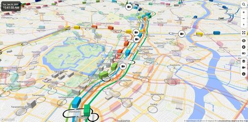
E316 - Mini Tokyo 3D - Akihiko Kusanagi - 2019 (Spencer Huang)
51
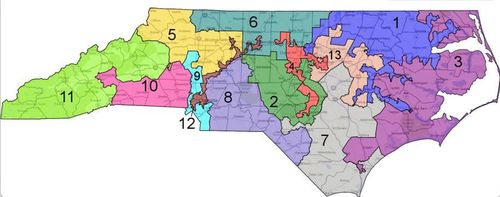
E316 - North Carolina Gerrymandering Map (Phil Clifton)
52
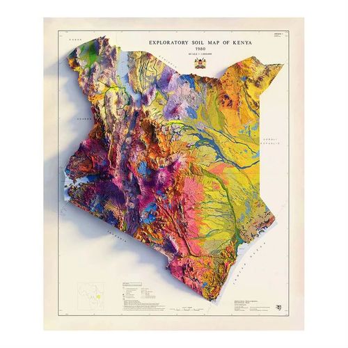
E316 - Kenya 1980 Shaded Relief Map - Sean Conway - 2021 (Luke Zanuck)
53
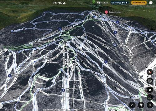
E316 - FATMAP (Sam Wexler)
54
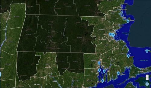
E316-- Massachusetts Sea Level Speculations Map--Stone Murphy
55
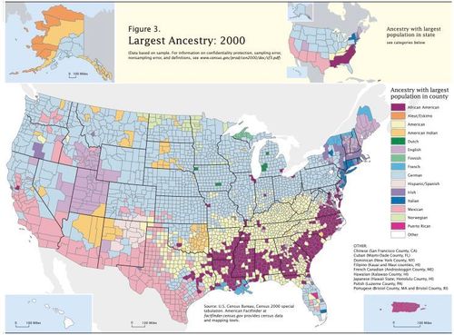
E316 - Map of U.S Ancestry - U.S Census Bureau - 2000 (Vaughn Sanders)
56
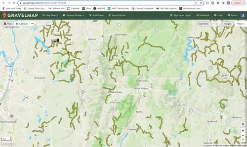
E316 - GravelMap - Whitewater - 2023 (Myer Liebman)
57
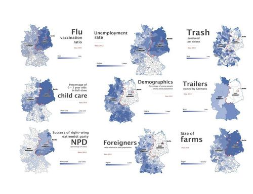
E316 - Maps Detailing the Contemporary Divisions between the Eastern and Western parts of Germany - Rick Noack - 2014, data gathered between 2009 and 2013. (Bradley St. Laurent)
58
E316 - Speculations
59
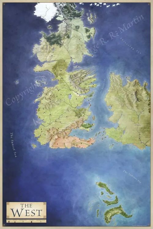
E316 - The West-George RR Martin-2012 (Tommy Goodwin)
60
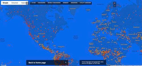
E316 - Endangered Languages Project Map, Screenshot from 1/25/23 (Leo Marburg)
61
E316 - Media Markets and Voting - Wikipedia, The New York Times, EchoStar Knowledge Base - Data from between 2006 and 2022 (Aidan O'Brien-Olwell)
62
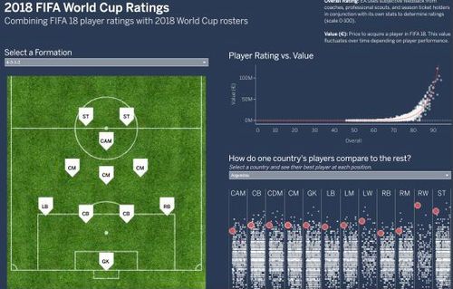
E316 Scott Teal – Fifa World Cup Rankings – 2018 (Toby Foehl)
63

E316 - Raid Map Layout - 2012 (John Skavlem)
64
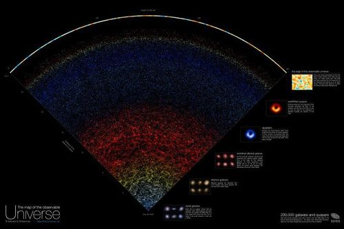
E316 - Map of the Universe - (Cam Maguire)
65
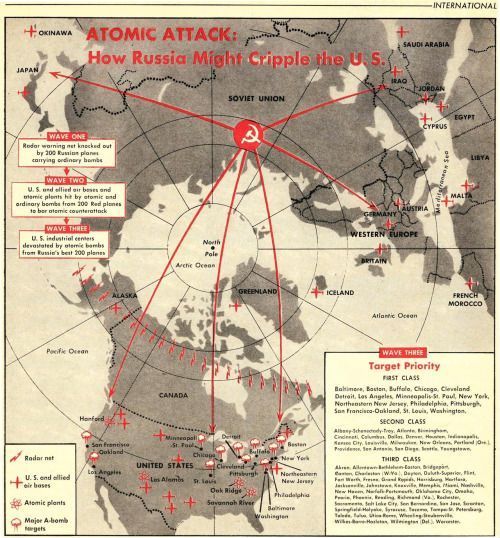
E316 Atomic Attack: How Russia Might Cripple the U.S. (David Cooper-Boyce)
66
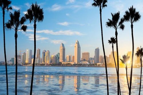
E316 - Google MyMaps - Key Locations in Sunny San Diego (Joseph Grillo)
Place a DOT on the image